Text-to-Image
Interior Design
通用
Crimson and Rouge: Red Needs to Be Grounded
Prompt
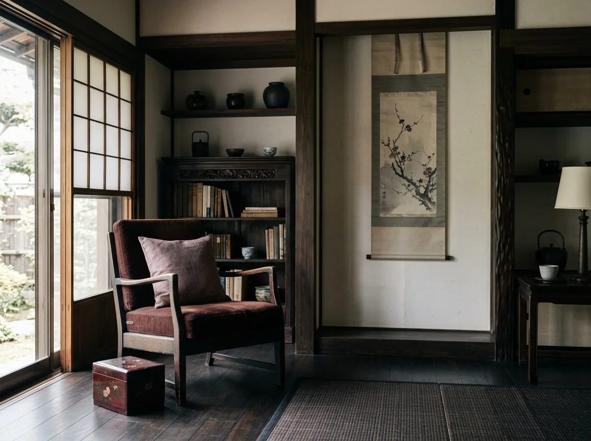
A space using low-saturation red colors. The red here is not the bright red of Chinese knots and spring couplets, but two deeper reds: 'Jiang' (crimson) – a deep red with a lot of brown and black, like aged lacquerware; and 'Rouge' – a grayish, dark rose red. Their usage is extremely minimal: 'Jiang' appears on the upholstery of a single chair and a lacquer box; 'Rouge' appears on a throw pillow and a detail of a painting. The total area does not exceed one-tenth of the image. Everything else is off-white, dark wood, and dark gray. Because of the low saturation and minimal use, this red appears subtle and aged, not gaudy. Avoid: using high-saturation true red and vermilion, expanding the area of red, adding gold decorations to pair with red, using red on large surfaces like walls.
Translated from Chinese by AI.
Show the original prompt
一個使用低彩度紅色的空間。這裡的紅不是中國結與春聯的那種正紅,而是兩種更沉的紅:絳色——帶著大量褐與黑的深紅,像陳年的漆器;以及胭脂——帶灰的暗玫瑰紅。它們的用量極少:絳色出現在一張單椅的軟包與一只漆盒上;胭脂出現在一個抱枕與一幅畫的局部。總面積不超過畫面的一成。其餘全部是米白、深木與黛色。因為彩度低且用量少,這個紅顯得含蓄而有年代感,不會俗豔。避免:使用高彩度的正紅與朱紅、讓紅色的面積擴大、加入金色的裝飾與紅色搭配、把紅色用在牆面等大面積上。




