Text-to-Image
Interior Design
通用
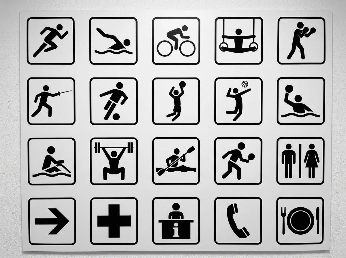
Tokyo 1964 Icon System: A Complete Set of Symbols Independent of Language
Prompt
To enable visitors who understand neither Japanese nor English to navigate independently, a symbol system expressed entirely through graphics was designed: each sport, facility, and service has an icon, composed of pure black silhouettes, capturing the most recognizable outline of an action or object, removing all details and perspective. All icons are established within the same square frame, with consistent line thickness and white space ratio. This was the first comprehensive icon system deployed for an international event in history, and almost all public signage since has been built upon this foundation. Icons are printed in black on a white background on signage boards, arranged regularly. Frontal shot of an indoor signage wall, with multiple icons juxtaposed in an array. Avoid: icons with perspective or gradients, inconsistent line thickness, adding text descriptions, inconsistent style.
Translated from Chinese by AI.
Show the original prompt
為了讓不懂日文也不懂英文的訪客能夠自行行動,設計一套完全以圖形表達的符號系統:運動項目、設施與服務各有一個圖標,以純黑剪影構成,取動作或物件最具辨識性的輪廓,去除所有細節與透視。所有圖標建立在同一個方形框內,線條粗細與留白比例一致。這是史上第一套為國際活動全面部署的圖標系統,之後幾乎所有的公共標示都建立在這個基礎上。圖標以白底黑圖印在標示板上,排列規律。室內標示牆正面拍攝,多個圖標並置成陣列。避免:圖標帶透視或漸層、線條粗細不一、加入文字說明、風格不統一。




