Text-to-Image
Interior Design
通用
Colors Are Faded, Not Intense
Prompt
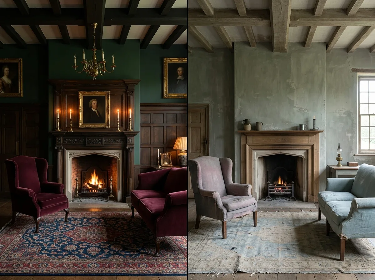
Two sets of English color palettes are placed side-by-side for comparison. The left side is for a mansion: saturated dark green, burgundy red, Prussian blue, and mustard yellow, with rich, high-chroma, low-value colors that appear luxurious and heavy when paired with dark wood and candlelight. The right side is for a cottage: the same hues but all muted by two or three steps—grey-green, grey-pink, duck egg blue, oatmeal beige, ochre, with low chroma and medium value, as if faded by sun and washing. The reason is practical: country folk used homemade lime wash and earth pigments, which naturally couldn't produce intense colors and would chalk and fade over time. The image should show the same room with two different colorings. Avoid: making the two look identical, using saturated dark colors in the cottage version, depicting the cottage as entirely white and devoid of color, changing the room's layout and furniture.
Translated from Chinese by AI.
Show the original prompt
兩組英式配色的並置對照。左側是宅邸的:飽和的深綠、勃根地紅、普魯士藍與芥末黃,顏色濃、彩度高、明度低,配上深色木頭與燭光顯得華麗而厚重。右側是小屋的:同樣的色相但全部降了兩三階——灰綠、灰粉、鴨蛋藍、燕麥米、赭土色,彩度低、明度中等,像是被日曬與洗滌褪過。原因很實際:鄉下用的是自製的石灰漆與土性顏料,本來就顯不出濃烈的顏色,而且會隨時間粉化變淡。畫面以同一個房間的兩種上色呈現。避免:讓兩者看起來相同、在小屋版本使用飽和的深色、把小屋畫成全白失去顏色、改變房間的格局與家具。




