Text-to-Image
Architecture
通用
UK Rail Rail Alphabet: Double Arrow & Station Signage
Prompt
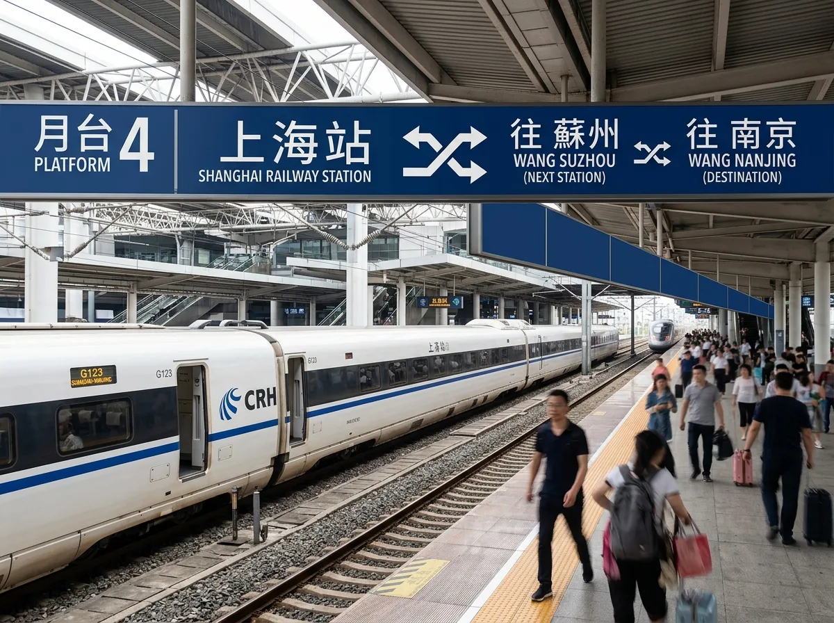
A unified national station signage system: typeface stroke terminals are slightly narrowed to prevent blurring at a distance, all using mixed case. The identification mark is an abstract symbol composed of double-headed arrows, simultaneously suggesting double tracks and round trips. Signage extends as continuous horizontal bands along platforms or station facades, with dark blue text on a white background or white text on a dark blue background, chosen according to ambient brightness. All stations, regardless of size, adopt the same set of rules, with only the station name differing. Panels are made of enamel or painted metal, with clean edges. Shot laterally on the platform, with the signage band extending in perspective. Avoid: each station customizing its style, adding decoration to the mark, mixing typefaces, signage band interrupted by advertisements.
Translated from Chinese by AI.
Show the original prompt
一套統一全國車站的標示系統:字體筆畫末端略微收窄以避免在遠距離糊成一團,全部使用混合大小寫。識別標記為一個由雙向箭頭構成的抽象符號,同時暗示雙軌與往返。標示以連續的橫帶形式沿月台或站體立面延伸,深藍底白字或白底深藍字,兩者依環境亮度選用。所有車站不論大小都採用同一套規則,只有站名不同。板材為搪瓷或烤漆金屬,邊緣簡潔。月台側向拍攝,標示帶在透視中延伸。避免:每站自訂樣式、標記加上裝飾、字體混用、標示帶被廣告打斷。