Text-to-Image
Interior Design
通用
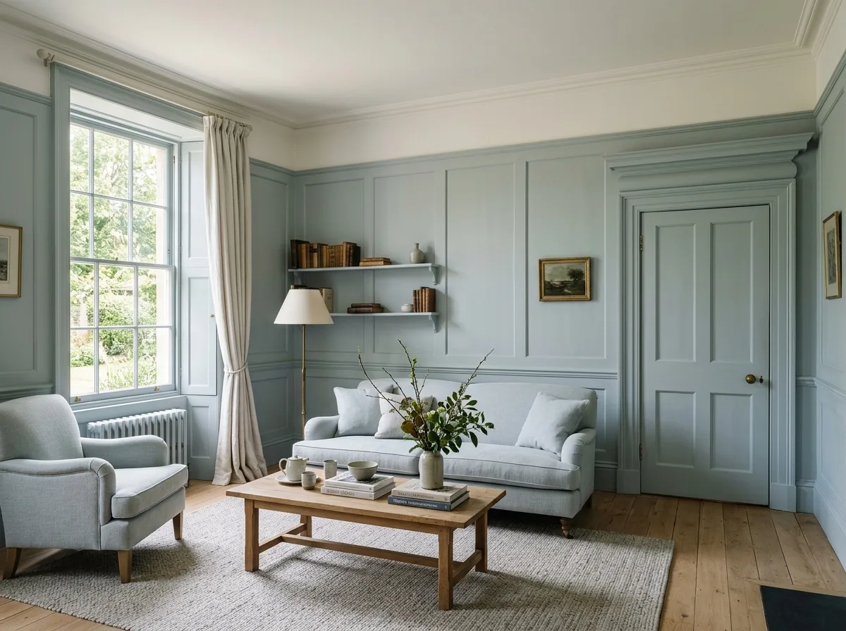
Historical colors, modern version: Lowering saturation by one step
Prompt
A space that uses a historical color palette but with adjustments. The hues are taken from traditional English and French historical colors—dove gray, racing green, Prussian blue, ochre, and terracotta red—but each has been desaturated and slightly lightened, becoming softer, closer to neutral, and less intensely aged. Walls, woodwork, door frames, and baseboards are all painted the same color, using an eggshell finish that reflects softly. The ceiling remains a lighter warm white. Soft furnishings use a monochromatic scheme, one shade lighter than the walls. Because the hues are historically based but the saturation is contemporary, the space appears both profound and not old-fashioned. Avoid: using saturated original historical colors, painting the ceiling a dark color, using different colors for woodwork and walls, using high-gloss finishes.
Translated from Chinese by AI.
Show the original prompt
一個使用歷史色譜但調整過的空間。顏色的色相取自傳統的英式與法式歷史色——鴿灰、賽車綠、普魯士藍、赭石與陶土紅——但每一種都被降低了彩度並提高了一點明度,變得更柔和、更接近中性,少了濃烈的年代感。牆面、木作、門框與踢腳板全部漆成同一種顏色,使用蛋殼光的塗料,反射柔和。天花維持較淺的暖白。軟裝則使用比牆面更淺一階的同色系。因為色相有歷史根據但彩度是當代的,空間顯得既有底蘊又不老氣。避免:使用飽和的歷史原色、把天花也漆成深色、讓木作與牆面使用不同顏色、使用高光的漆面。




