Text-to-Image
Interior Design
通用
Hue-Tinged Black: No Need for Pure Black
Prompt
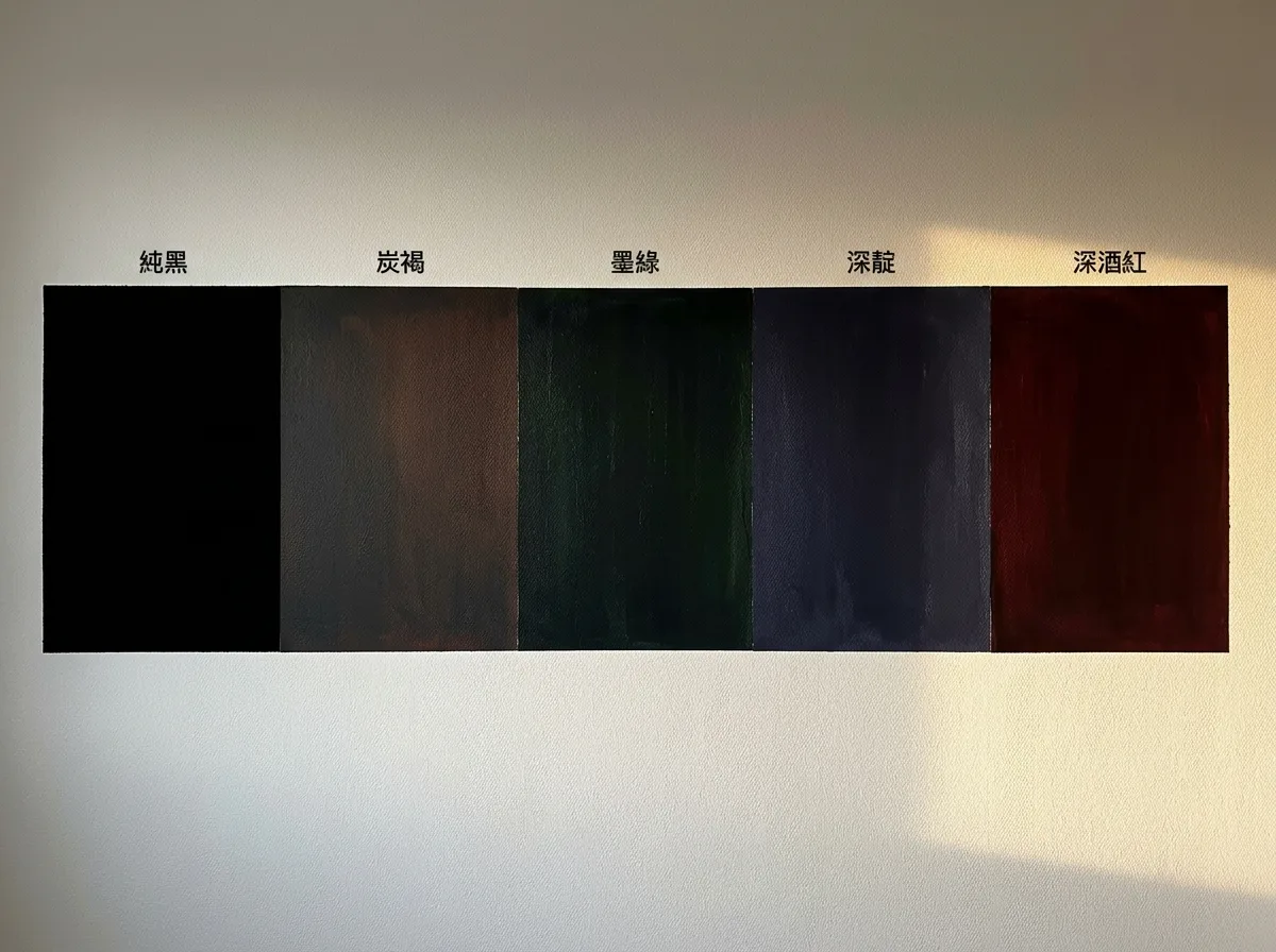
A set of dark color juxtapositions. Pure black is placed on the far left as a comparison—it shows no color variation in light, appearing flat and stark. Moving to the right, in order: charcoal brown—black with brown and a touch of red, appearing warm under warm light; forest green—black with green and blue, revealing a subtle green hue in light; deep indigo—black with blue and purple, appearing cool and deep; deep burgundy—black with red, rich and subdued. All four appear black from a distance, but when light falls upon them, they reveal their respective hues, thus having depth instead of being a hollow expanse. The image presents five color blocks on the same wall, compared under the same light.
Avoid: making the five look identical, increasing the saturation to make them distinct colors, using flat paint that reflects no light, changing the angle of the light source.
Translated from Chinese by AI.
Show the original prompt
一組深色的並置比較。純黑放在最左邊作為對照——它在光下沒有任何顏色的變化,看起來扁平而生硬。往右依序是:炭褐——黑加了褐與一點紅,在暖光下顯得溫暖;墨綠——黑加了綠與藍,在光下會透出微妙的綠;深靛——黑加了藍與紫,顯得冷而深;深酒紅——黑加了紅,濃而沉。四種在遠處看都像黑,但在光線落上去時會顯出各自的色相,因此有深度而不是一片空洞。畫面以同一面牆的五個色塊呈現,在同一道光下比較。避免:讓五者看起來相同、把彩度提高變成明確的顏色、使用平光的漆讓光完全不反射、改變光源的角度。




