Text-to-Image
Interior Design
通用
Supermarket Fresh Food Section: Refrigeration, Lighting, and Food Colors
Prompt
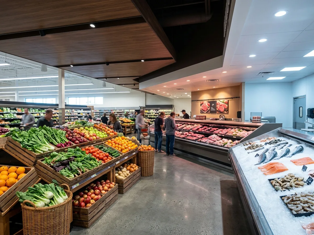
The core design of the fresh food section is to make the food look fresh, and this almost entirely depends on the lighting: the fruit and vegetable section uses high color rendering, neutral color temperature light, so that greens are green and reds are red; the meat section's light is a bit warmer but not so red as to be distorted; the seafood section is cooler, bluer, complementing the texture of crushed ice. The lighting in these three areas is different, so the atmosphere changes as you walk through. Displays use stepped, slanted counters, with products facing the customers; fruits and vegetables are placed directly in wooden crates or wicker baskets, conveying a sense of origin; seafood is laid on crushed ice, with reflections from the water. The ceiling in the fresh food section is lowered, and the material is changed to wood or dark colors, focusing attention on the products. Daytime shot, the differences in lighting across the three sections, the slanted counter displays, and the colors of the products are all visible. Avoid: using the same color temperature throughout the entire area, products laid flat not facing customers, ceiling being the same as other areas of the store, low color rendering of light sources making food appear gray.
Translated from Chinese by AI.
Show the original prompt
生鮮區的設計核心是讓食物看起來是新鮮的,而這幾乎完全取決於燈:蔬果區用高演色性、色溫偏中性的光,讓綠是綠、紅是紅;肉品區的光偏暖一點但不能過紅到失真;海鮮區偏冷、偏藍,配合碎冰的質感。這三區的燈光不同,因此走過時氣氛會變。陳列使用階梯式的斜檯,商品朝向客人;蔬果直接放在木箱或藤籃裡,傳達產地感;海鮮鋪在碎冰上,有水的反光。天花在生鮮區降低,材質換成木質或深色,把注意力集中在商品上。日間拍攝,三區照明的差異、斜檯陳列與商品的顏色同時可見。避免:全區使用同一種色溫、商品平放不朝向客人、天花與賣場其他區相同、光源演色性低使食物發灰。




