Text-to-Image
Interior Design
通用
Mexico City Metro: A Station Naming System Replacing Text with Icons
Prompt
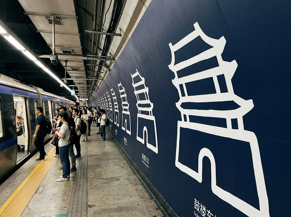
Mexico City Metro: A station naming system that replaces text with images.
Each station has a unique image, drawn from nearby landmarks, historical events, or topography, rendered with extremely thick lines and a single color. It can be recognized and remembered without literacy. The importance of the image is higher than the station name text—the station name is placed in small letters below the image. This system was designed for cities with a high illiteracy rate and is the most powerful case for "the readability of signage should be determined by the actual abilities of the user." The images are repeated on the platform walls, large enough to be seen from inside the train car. The color scheme is a single line color plus white. Wide-angle shot of the platform, with continuous images repeating along the wall. Avoid: overly detailed images, text larger than images, images unrelated to the location, mixed multiple colors.
Translated from Chinese by AI.
Show the original prompt
每一個車站有一個專屬的圖像,取材自該站附近的地標、歷史事件或地形,以極粗的線條與單一顏色繪成,不需識字就能辨認與記憶。圖像的重要性高於站名文字——站名以小字置於圖像之下。這個系統為文盲比例高的城市而設計,是「標示的可讀性應由使用者的實際能力決定」最有力的案例。圖像在月台牆面上重複出現,尺寸大到從車廂內就能看見。配色為單一路線色加白。月台廣角拍攝,連續的圖像沿牆重複。避免:圖像過於細緻、文字大於圖像、圖像與地方無關、多色混雜。




