Text-to-Image
Interior Design
通用
The Line Between Tacky and Luxurious: Real vs. Fake Materials
Prompt
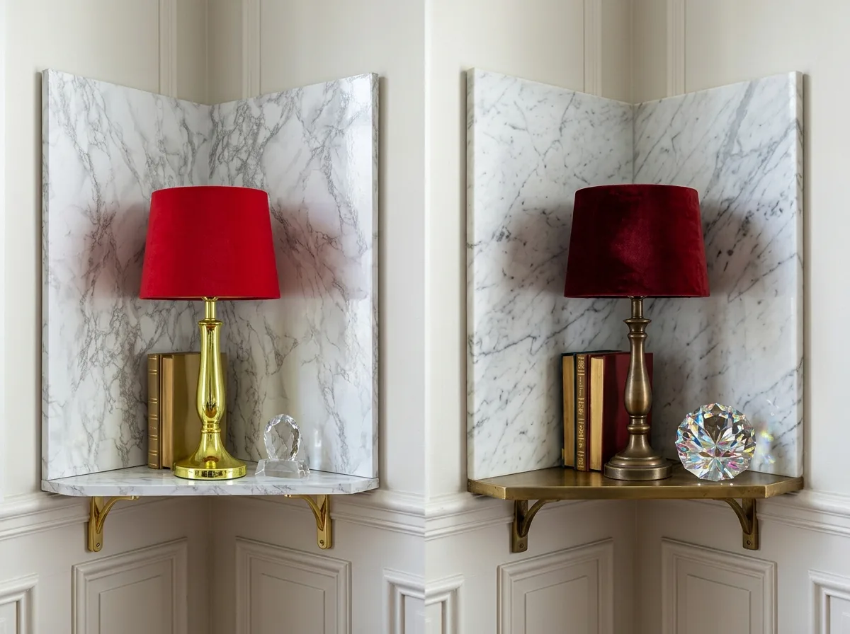
Two material versions of the same corner juxtaposed for comparison. The left side uses cheap imitation materials: printed fake marble laminate, with a repetitive printed pattern and no thickness; plastic chrome-plated imitation gold hardware, with a uniform mirror-like bright gold surface that is yellowish-green; polyester imitation velvet, with short, uniform pile that does not change color with direction; acrylic fake crystal, with excessive transparency and dull facets. The right side uses genuine materials: natural marble with continuous, non-repeating veins and visible thickness at the edges; solid brass with varying shades after oxidation; real silk velvet that shows distinct light and dark variations with direction; hand-cut crystal that refracts fragmented light spots. Avoid: making the two sides look similar, using brightness differences instead of material differences, drawing the right side as overly ostentatious, changing the arrangement of the two sides.
Translated from Chinese by AI.
Show the original prompt
同一個角落的兩種材料版本並置對照。左側使用廉價的仿製材料:印刷的假大理石美耐板,紋理是重複的印刷圖案且沒有厚度;塑膠鍍鉻的仿金五金,表面是均勻的鏡面亮金,顏色偏黃綠;聚酯纖維的仿絲絨,絨毛短而均勻,不隨方向變色;壓克力的假水晶,透明度過高、切面呆板。右側使用真材料:天然大理石的脈絡連續而不重複,邊緣看得見厚度;實心黃銅經氧化後有深淺層次;真絲絨隨方向產生明顯的深淺;手工切割的水晶折射出細碎的光斑。避免:讓兩側看起來相似、用亮度差異取代材質差異、把右側畫成過度浮誇、改變兩側的配置。




