Text-to-Image
Interior Design
通用
Corridors Are Not Corridors: Cutting Length into Paragraphs
Prompt
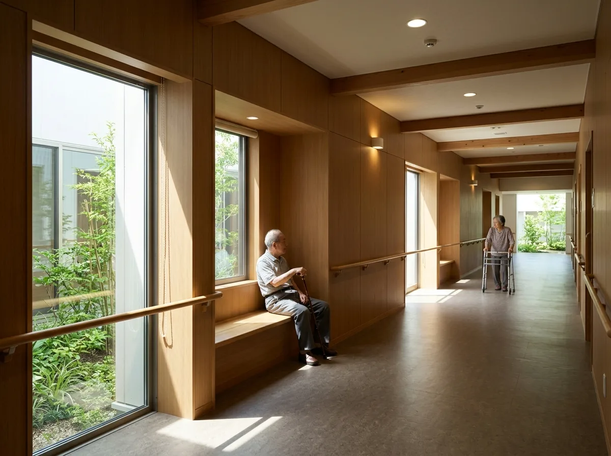
The most draining space in a hospital is the seemingly endless corridor. The design response is to break its length into perceptible segments: every so often, open a window or a small atrium to let natural light in, place a seating alcove at a turn, mark segments with changes in ceiling height or floor material, and ensure the end always has light, not just a door. For patients in rehabilitation, aiming to "walk to the next window" is much easier than "walking to the end of the corridor." Handrails are continuous, and flooring is non-reflective. Photographed along the depth of the corridor during the day, with the rhythm of light and the segmentation of sections clearly visible. Avoid: straight, long corridors without windows, ends being a door or wall, uniform lighting without variation, highly reflective flooring.
Translated from Chinese by AI.
Show the original prompt
醫院最消磨人的空間是那條看不到盡頭的走廊。設計的回應是把長度切成可以感知的段落:每隔一段就開一扇窗或一個小中庭讓自然光進來、在轉折處放一個可以坐下的凹龕、以天花高度或地坪材質的變化標記段落、並讓盡頭一定有光而不是一扇門。復健中的病人以「走到下一扇窗」為目標,比「走到走廊底」容易得多。扶手連續、地坪無反光。日間沿走廊縱深拍攝,光的節奏與段落的分隔清楚。避免:走廊筆直冗長無窗、盡頭為門或牆、照明均勻無變化、地坪高反光。




