Text-to-Image
Interior Design
通用
Yingge and Miaoli: The Colors of Two Kinds of Pottery
Prompt
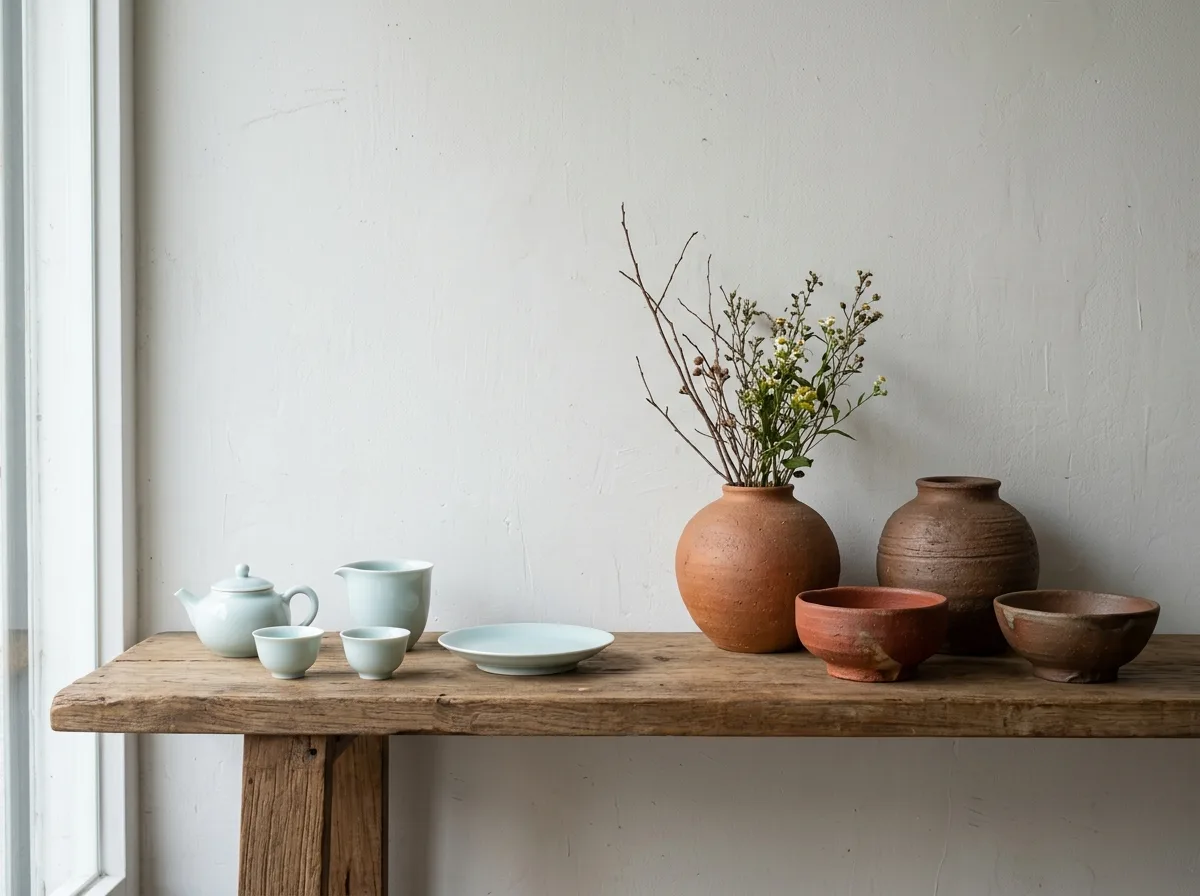
Two sets of Taiwanese pottery from different origins are displayed side by side on the same shelf, creating a contrast in color and texture. One set consists of delicate white porcelain and celadon: thin body, smooth surface, clear moon white and pale celadon glazes, upright forms, and neat foot rings, suitable for tea sets and tableware. The other set is robust red clay pottery: thick and heavy body, warm brick red and earthy brown colors, retaining handmade irregularities and granular texture on the surface, full forms, suitable for flower vases and bowls. There is a clear separation between the two sets. The background is a plain wooden shelf and white wall, with natural light coming from the side to highlight the textural differences. Avoid: depicting the two sets with similar textures, adding high-saturation decorative glazes, using an industrial mass-produced regularity, making the shelf overly crowded.
Translated from Chinese by AI.
Show the original prompt
同一個層架上並列兩組不同產地的台灣陶器,顏色與質感形成對比。一組是細緻的白瓷與青瓷:胎體薄、表面光滑,釉色是清透的月白與淡青,器型端正,有工整的圈足,適合茶具與餐具。另一組是粗獷的紅土陶:胎體厚重,顏色是溫暖的磚紅與土褐,表面保留手作的凹凸與顆粒,器型飽滿,適合花器與缽。兩組之間留有明確的間隔。背景是素色的木層板與白牆,自然光從側面照過來突顯質感差異。避免:把兩組畫成相似的質感、加入高彩度的裝飾釉、使用工業量產的規整感、把層架擺得過於擁擠。




