Text-to-Image
Interior Design
通用
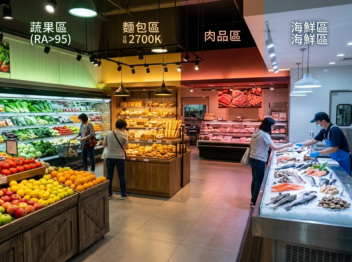
Supermarket Fresh Food Section: One Color Temperature Per Product
Prompt
A supermarket's fresh produce section, where different product areas use specialized lighting with different spectra, showing distinct color temperature zones within the same frame. Vegetable and fruit section: High color rendering index neutral white with a greenish spectrum, making lettuce vibrant green, tomatoes bright red, and fruit color differences clear. Meat section: Warm light with a reddish spectrum, making raw meat appear a healthy fresh red instead of grayish-brown. Bakery section: Low color temperature warm yellow light, making baked goods' crust golden and appealing. Seafood section: Cooler white light, paired with crushed ice, emphasizing freshness and coolness. Each area's lighting fixtures are dedicated, with light spots precisely covering the respective counter surfaces, and color transitions visible between zones. Avoid: Using a single color temperature throughout, making meat appear gray under cool light, causing fruits and vegetables to lose saturation, or blending the light from different areas into one.
Translated from Chinese by AI.
Show the original prompt
一個超市的生鮮區,不同商品區使用不同光譜的專用照明,在同一畫面中可以看出色調的分區。蔬果區:高演色性的中性白偏綠光譜,生菜翠綠、番茄鮮紅、水果的色差清楚。肉品區:偏紅光譜的暖光,讓生肉呈現健康的鮮紅而不是灰褐。麵包區:低色溫的暖黃光,讓烘焙品的表皮金黃誘人。海鮮區:偏冷的白光,搭配碎冰,強調新鮮與清涼。各區的燈具都是專屬的,光斑範圍剛好覆蓋該區的檯面,區與區之間可以看見色調的轉換。避免:全場使用單一色溫、讓肉品在冷光下顯灰、讓蔬果失去飽和度、把各區的光混成一片。




