Text-to-Image
Architecture
通用
Night Brightness: Sign Not Brighter Than Store Interior
Prompt
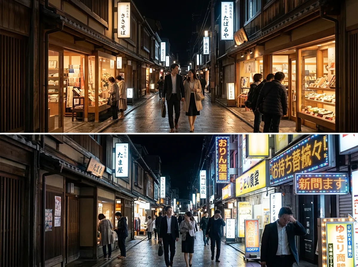
A comparison of lighting relationships on a night shopping street. The upper half shows the ideal state: signboard brightness is controlled to medium, while interior lighting and display windows are the brightest, thus guiding people's gaze into the shop. The overall brightness hierarchy of the street is comfortable, and pedestrians' faces are clearly visible. The lower half shows an uncontrolled state: signboards use high-brightness LEDs and scrolling displays, far exceeding the brightness inside the shops. Eyes are drawn to the signboards, completely obscuring the merchandise. Because every shop tries to outshine others, the entire street becomes a dazzling light pollution, making nothing memorable. The architecture and signboard positions are the same in both. Avoid: making the two similar, completely turning off signboards in the ideal version, using colorful scrolling displays in the ideal version, having different numbers of storefronts in the two versions.
Translated from Chinese by AI.
Show the original prompt
一段夜間商店街的照明關係對照。上半是理想狀態:招牌的亮度被控制在中等,店內的照明與櫥窗才是最亮的,因此人的視線被引導往店內看,街道整體的亮度層次舒服,行人的臉也看得清楚。下半是失控的狀態:招牌使用高亮度的 LED 與跑馬燈,亮度遠超過店內,眼睛被招牌吸走完全看不見商品,而且因為每家都在比亮,整條街變成一片刺眼的光害,反而什麼都記不住。兩者的建築與招牌位置相同。避免:讓兩者相似、在理想版本把招牌完全關掉、使用彩色跑馬燈在理想版本、讓兩者的店面數量不同。