Text-to-Image
Interior Design
通用
Age-Friendly: Contrast, Handrails, and Recognizable Flooring
Prompt
Elderly Friendly: Contrast, Handrails, and Recognizable Flooring
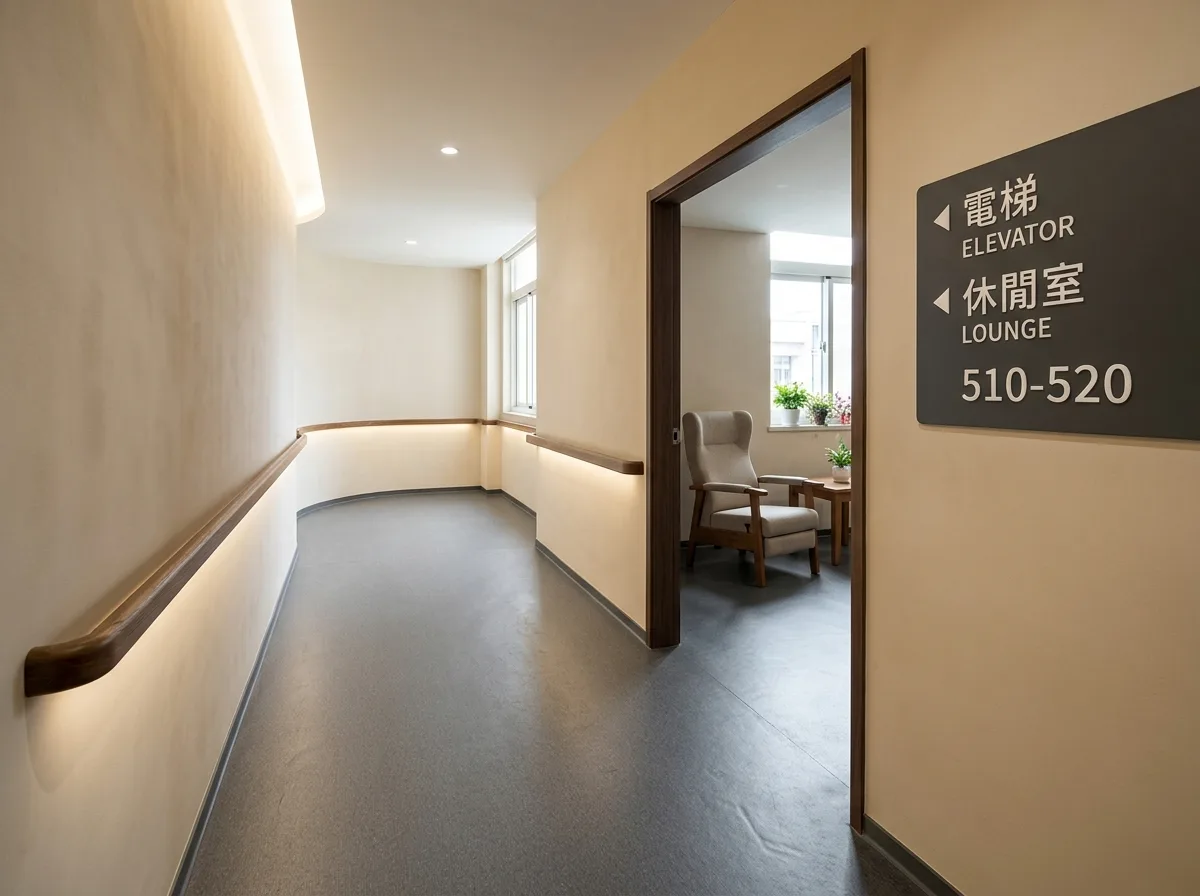
Designed for people with deteriorating vision and reduced mobility: increase the luminance contrast between walls and floors, and doors and walls, to make boundaries clearly discernible; avoid high-reflectance and strong patterns on flooring, as these can be mistaken for puddles or steps; handrails should be continuous and extend past corners; increase illuminance but completely avoid glare, especially reflections from the floor. Seating should have armrests and higher seat heights for easier rising. Signage text size should be enlarged, contrast enhanced, and positioned lower at eye level. These adjustments are beneficial for everyone. Daytime shot, with material contrast and continuous handrails clearly visible. Avoid: Floor and walls the same color, high-reflectance or strong geometric patterns on flooring, handrails interrupted at corners, direct visibility of light fixtures causing glare.
Translated from Chinese by AI.
Show the original prompt
為視力退化與行動遲緩的人設計:提高牆與地、門與牆之間的明度對比讓邊界清楚可辨;地坪避免高反光與強烈圖案,因為那會被誤認為積水或階差;扶手連續不中斷並延伸過轉角;照度提高但完全避免眩光,尤其是地面的反射。座椅要有扶手與較高的座面方便起身。標示的字級加大、對比加強、位置降低到視線高度。這些調整對所有人都好用。日間拍攝,材質的對比與連續的扶手清楚。避免:地與牆同色、地坪高反光或強烈幾何圖案、扶手在轉角中斷、燈具直接可見造成眩光。




