Text-to-Image
Architecture
通用
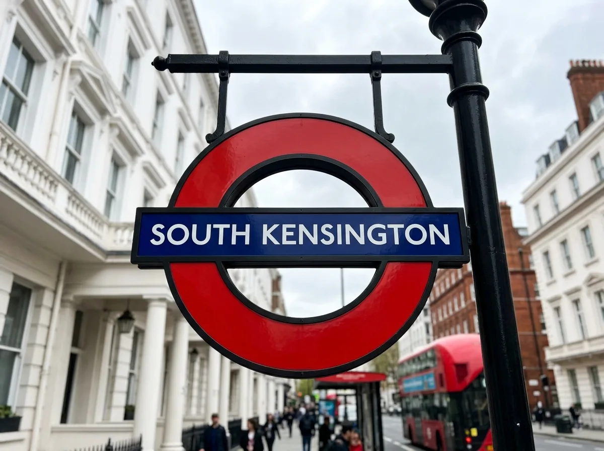
London Underground Roundel: Geometry and Proportion of Circle and Bar
Prompt
A red circle is pierced by a blue horizontal bar, with the station name on the bar—the entire power of this mark comes from its proportions: the thickness of the circle, the height and length of the bar, and the white space around the text within the bar; any change to these would weaken it. The mark is made of enamel, suspended above streets or standing in front of stations, and also repeated on platforms. The typeface is a specially designed humanist sans-serif, with even stroke weight, geometric yet not cold. The mark can be scaled down to a ticket or enlarged to architectural scale without losing its effectiveness. Shot from a low angle on the street, with the mark between buildings and the sky. Avoid: changing proportions, adding shadows or gradients, replacing the typeface, arbitrary relationship between mark and architecture.
Translated from Chinese by AI.
Show the original prompt
一個紅色的圓環被一道藍色的橫槓穿過,槓上是站名——這個標記的全部力量來自比例:圓環的粗細、橫槓的高度與長度、以及文字在槓內的留白,任何一項改變都會削弱它。標記以搪瓷製作,懸掛在街道上方或立於站前,也在月台上重複。字體為專門設計的人文無襯線,筆畫粗細均勻,幾何而不冷硬。標記可以縮小到票券上,也可以放大到建築的尺度而不失效。街道低角度仰拍,標記在建築與天空之間。避免:改變比例、加陰影或漸層、字體替換、標記與建築的關係隨意。