Text-to-Image
Interior Design
通用
Accessibility is Not a Separate Path
Prompt
Accessibility is Not a Separate Path
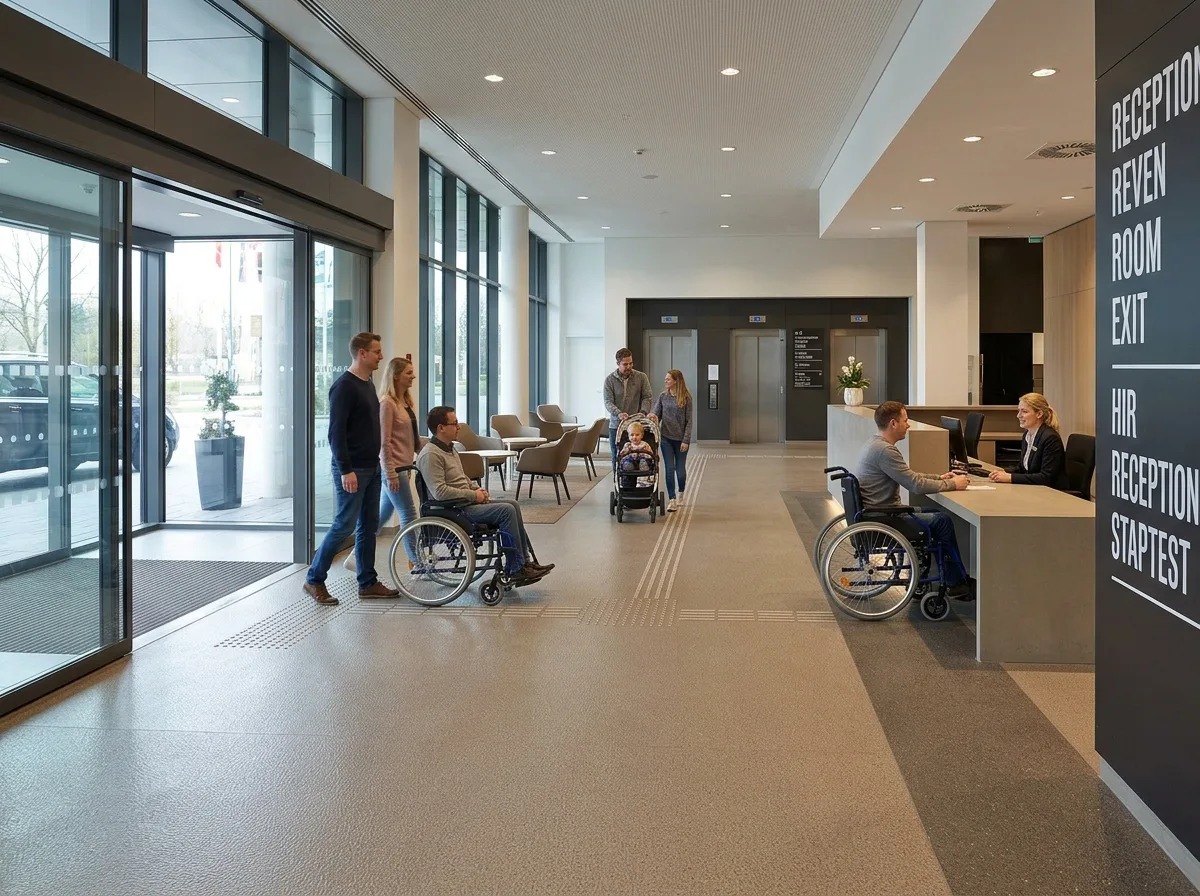
From the drop-off area to the guest room door, there are no steps along the entire path. The slope is gentle enough not to require signage. Wheelchairs, luggage, and strollers use the same main circulation path as everyone else, not a detour to a side entrance. The lobby reception desk has a lowered section, at a height where seated and standing individuals can make eye contact; the width of the aisles between seating areas is sufficient for turning; elevator buttons are within reach from a seated position, and the car has a mirror to see behind. Signage uses large, high-contrast fonts, not relying solely on color to convey information. All these treatments are integrated into the design language, making it unnoticeable that they are "specially made for someone." Daytime shot from a low perspective along the main circulation path, showing the seamless floor, aisle width, and lowered counter simultaneously.
Avoid: Setting up independent accessible side entrances and ramps, temporary steel plate ramps, lowered counters appearing as awkward additions, adding conspicuous accessibility stickers.
Translated from Chinese by AI.
Show the original prompt
從落客區到房門的整條路上沒有任何台階,坡度平緩到不需要標示,輪椅、行李箱與嬰兒車走的是跟所有人一樣的那條主動線,而不是繞到側門的另一條路。大廳的接待桌有一段降低的檯面,高度讓坐著的人與站著的人可以平視;座位區之間的通道寬度足夠迴轉;電梯的按鈕高度在坐姿可及的範圍,轎廂內有可以看到身後的鏡面。指標的字體大、對比高,不靠顏色單獨傳達資訊。這些處理全部融進設計語彙裡,看不出是「特別為誰做的」。日間從主動線的低視角拍攝,無高差的地坪、通道寬度與降低的檯面同時可見。避免:設置獨立的無障礙側門與坡道、出現臨時鋼板斜坡、降低檯面做成突兀的附加物、加設明顯的無障礙標誌貼紙。




