Text-to-Image
Interior Design
通用
Chinese Red Should Be a Step Lower, Not True Red
Prompt
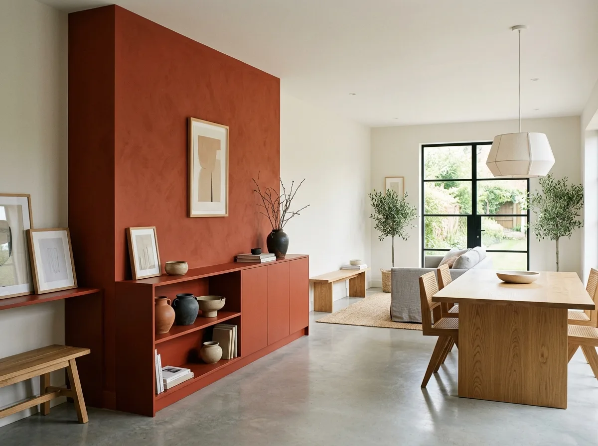
Chinese red should be one step down, not true red. A space with red as the main color, but not dazzling. The red is a vermilion or crimson with a hint of orange or darkness, not a festive true red. It is applied in a large area on one wall or a set of cabinets, with the rest remaining off-white and light gray. The red area occupies about one-third of the field of vision, concentrated in one place rather than scattered. Avoid: using saturated, bright true red, covering all walls with red, pairing it with gold trim and carvings, or having red scattered in many small pieces, making it look messy.
Translated from Chinese by AI.
Show the original prompt
一個以紅為主色但不刺眼的空間。紅是帶一點橘或一點暗的朱紅與絳紅,不是節慶的正紅,大面積塗在一道牆或一組櫃體上,其餘維持米白與淺灰。紅的面積約佔視野的三分之一,集中在一處而不是四散。避免:使用飽和到發亮的正紅、把紅鋪滿所有牆面、配上金色的滾邊與雕花、讓紅色散在許多小塊上顯得凌亂。




