Text-to-Image
Interior Design
通用
Solid and Void: Placing Emptiness Next to Heaviness
Prompt
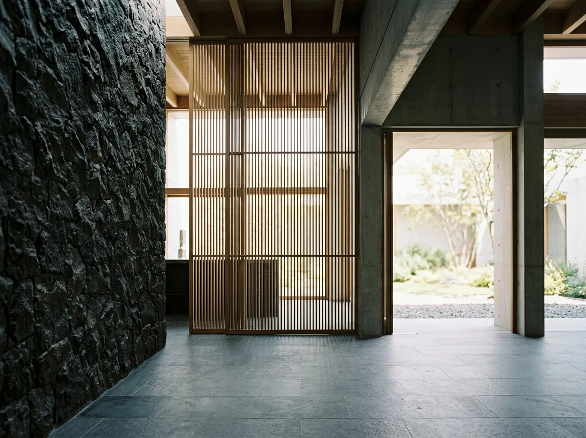
A space organized by the contrast of solid and void. The solid part is a full-height, heavy stone wall, with a strong sense of mass, completely opaque, and deep in color, occupying one-third of the image; immediately adjacent to it is the void part—a whole transparent wooden grille screen, with light filtering through from behind, almost weightless; further beyond is a completely empty doorway, without even a grille. Thus, from left to right, the density of the space gradually decreases: solid, semi-void, full void. This rhythm gives the large-scale space layers and breath, rather than being solid all the way through. The flooring is continuous stone, passing through these three segments. Avoid: making the density of the three segments similar, making the void part completely enclosed, adding more materials to disrupt the rhythm, having trim strips appear at the junctions.
Translated from Chinese by AI.
Show the original prompt
一個以虛實對比組織的空間。實的部分是一面通高的厚重石材牆,質量感強烈、完全不透、顏色深沉,佔畫面的三分之一;緊鄰著它的是虛的部分——一整片通透的木格柵屏,後方的光透過來,幾乎沒有重量;再過去是一個完全空的門洞,連格柵都沒有。因此從左到右,空間的密實度逐級遞減:實、半虛、全虛。這種節奏讓大尺度的空間有了層次與呼吸,而不是一路實到底。地坪是連續的石材,穿過這三個段落。避免:讓三個段落的密實度接近、把虛的部分做成完全封閉、加入更多材料打亂節奏、讓交界處出現收邊條。




