Text-to-Image
Interior Design
通用
Indigo and Ink: A Blue-Gray Close to Black
Prompt
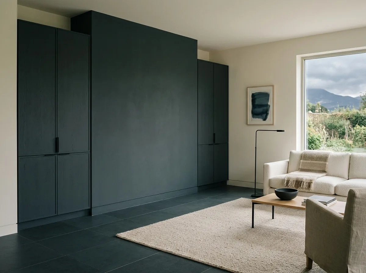
A space with 'dai' (黛) as its main tone. 'Dai' is not pure black nor neutral gray, but an extremely deep gray with a blue-green undertone, like distant mountains on a cloudy day; its lightness is very low, but its hue is still discernible. It is used on large surfaces—an entire wall, floor-to-ceiling wooden cabinets, and part of the floor. The surface is matte and light-absorbing, making the color appear deep and沉, non-reflective. It is paired with 'mo' (墨)—closer to pure black, used for fine lines and hardware details. The difference between the two is subtle but discernible. The remaining parts are off-white walls and light-colored textiles, providing contrast. The overall impression is quiet and substantial. Avoid: using pure black instead of 'dai'; depicting 'dai' as a neutral gray; using high-gloss surfaces; letting dark colors dominate the entire space without light-colored contrast.
Translated from Chinese by AI.
Show the original prompt
一個以黛色為主調的空間。黛不是純黑也不是中性灰,而是一種帶著藍綠底的極深灰,像遠山在陰天的顏色;明度極低但仍然看得出色相。它被用在大面積上——一整面的牆、通高的木作櫃體與地面的一部分,表面是霧面吸光的,因此顏色顯得深而沉、不反光。旁邊搭配的是墨色——更接近純黑、用在細部的線條與五金上。兩者的差異細微但可辨。其餘的部分是米白的牆與淺色的織品,提供對比。整體安靜、有重量。避免:使用純黑取代黛色、把黛色畫成中性的灰、使用高光的表面、讓深色佔滿整個空間沒有淺色對比。




