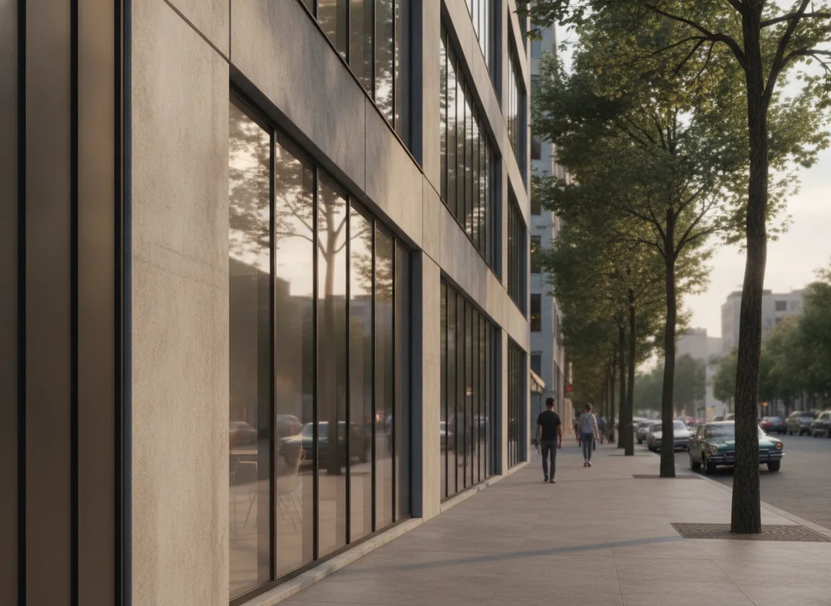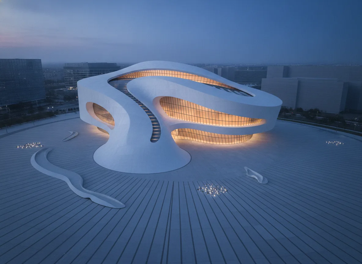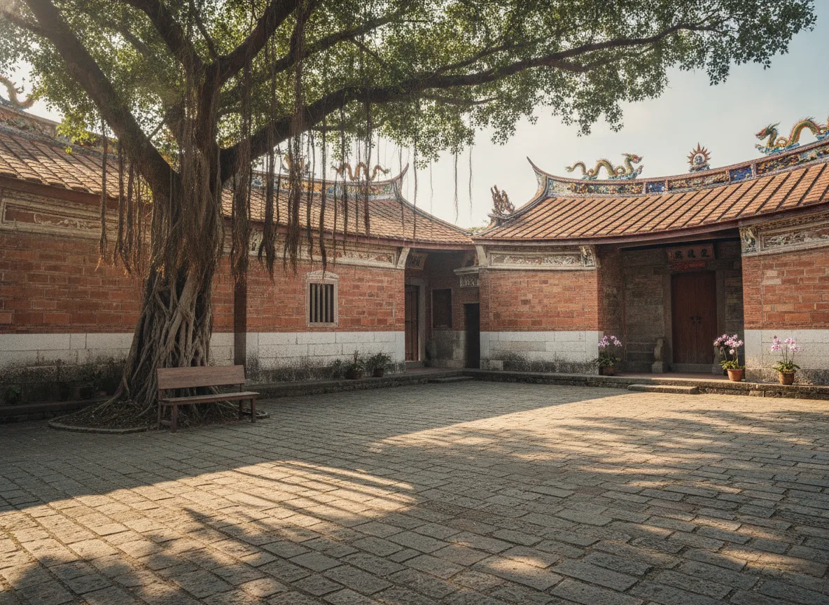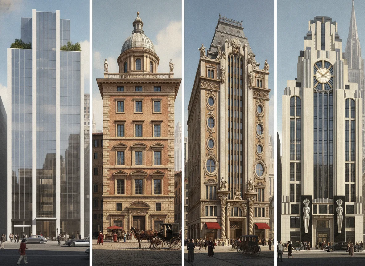
文生图
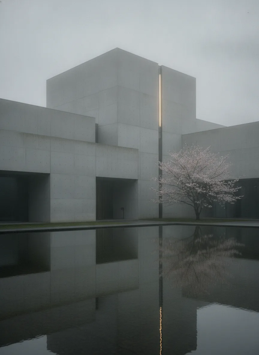
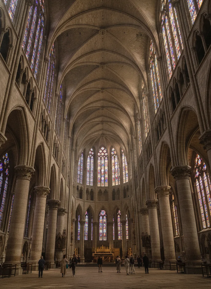
建筑外观
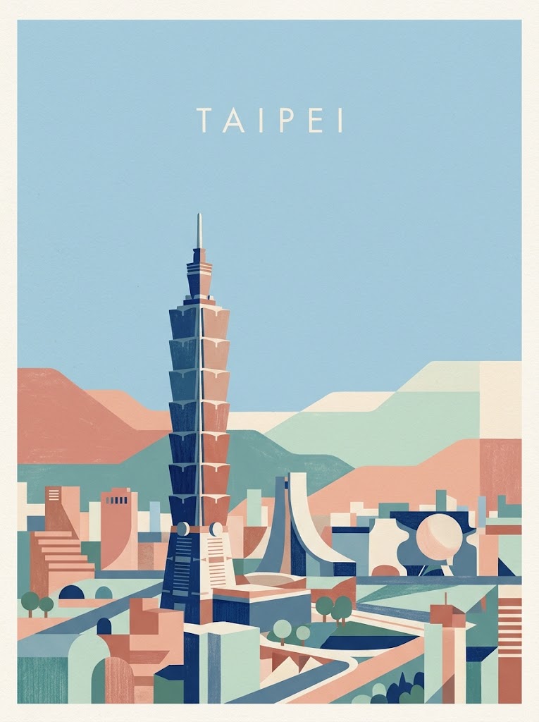
城市风格海报
提示词
DESTINATION LANDMARK-LED GEOMETRIC ART POSTER

Create a sophisticated vertical travel art poster featuring [DESTINATION] = Taipei.

FORMAT

Vertical poster

Aspect ratio: 2:3 or 3:4

High-resolution editorial travel poster

Generous negative space with a stable vertical composition

The entire image should feel like a complete, refined work of contemporary art

CORE CONCEPT

The most important principle of this poster is:

LANDMARK 70% + GEOMETRIC ABSTRACTION 30%

First, clearly depict the iconic landmarks and cityscape that make [DESTINATION] instantly recognizable.

Then apply geometric simplification and contemporary color-block composition on top of that recognizable foundation.

The order of priority must always be:

recognizable landmark first + artistic geometric simplification second

Do not reduce the landmarks to vague hints or abstract them so heavily that they lose their identity.

The viewer should immediately think:

“This is [DESTINATION].”

LANDMARK PRIORITY

Select 3–5 iconic visual elements that represent [DESTINATION].

Among them, choose the 1–2 most recognizable landmarks as the primary visual protagonists of the composition.

The main landmarks should:

Retain enough of their real-world form and silhouette to remain clearly recognizable

Preserve their essential proportions and distinctive architectural features

Have sufficient scale and visual presence within the composition

Be visually dominant over the surrounding abstract geometric forms

Do not break landmarks down excessively into circles, rectangles, semicircles, or other primitive shapes to the point where they lose their identity.

Preserve their silhouette and defining architectural characteristics while simplifying only unnecessary details.

If the destination includes towers, cathedrals, palaces, bridges, mountains, skylines, or other iconic structures, their defining structural features must remain clearly identifiable.

GEOMETRIC ABSTRACTION

Geometric abstraction should not replace the landmarks.

Instead, use it as a supporting design language that elegantly organizes and simplifies the landmarks and surrounding cityscape.

Possible geometric forms include:

Circles

Semicircles

Rectangles

Arches

Triangles

Stepped blocks

Simplified rooftops

Layered color fields

Use these geometric forms primarily to simplify:

Surrounding architecture

Roads

Rivers

Hills

Trees

Background skylines

Negative spaces between buildings

The landmarks themselves should retain approximately 70% of their recognizable real-world form, with only about 30% geometric simplification.

COMPOSITION

Keep approximately the upper 40–50% of the composition as spacious, quiet sky or open negative space.

At the upper center, place only the destination name:

[DESTINATION]

Use small, refined uppercase English typography:

Thin sans-serif

Wide letter spacing

Clean solid color

No additional text

No slogan

No subtitle

No small descriptive copy

Build the cityscape in the lower portion of the poster.

The most iconic landmark should be the first visual element that attracts the eye within the lower cityscape.

Arrange secondary architecture, natural features, bridges, rooftops, trees, rivers, hills, and other elements around the main landmark to create a coherent and natural urban landscape.

DESTINATION INTERPRETATION

Select 4–7 visually distinctive elements associated with [DESTINATION].

Possible elements include:

Iconic landmark

Famous architecture

City skyline

River or sea

Mountain or hill

Distinctive local rooftops

Bridges

Regional vegetation

Characteristic street patterns

Do not abstract every element to the same degree.

The most important landmarks should remain clear and specific, while the surrounding environment can be more simplified and geometric.

The visual hierarchy should be: