Text-to-Image
Architecture
通用
Northern Wei Regular Script Signage: Stroke Extension and Neon Tube Combination
Prompt
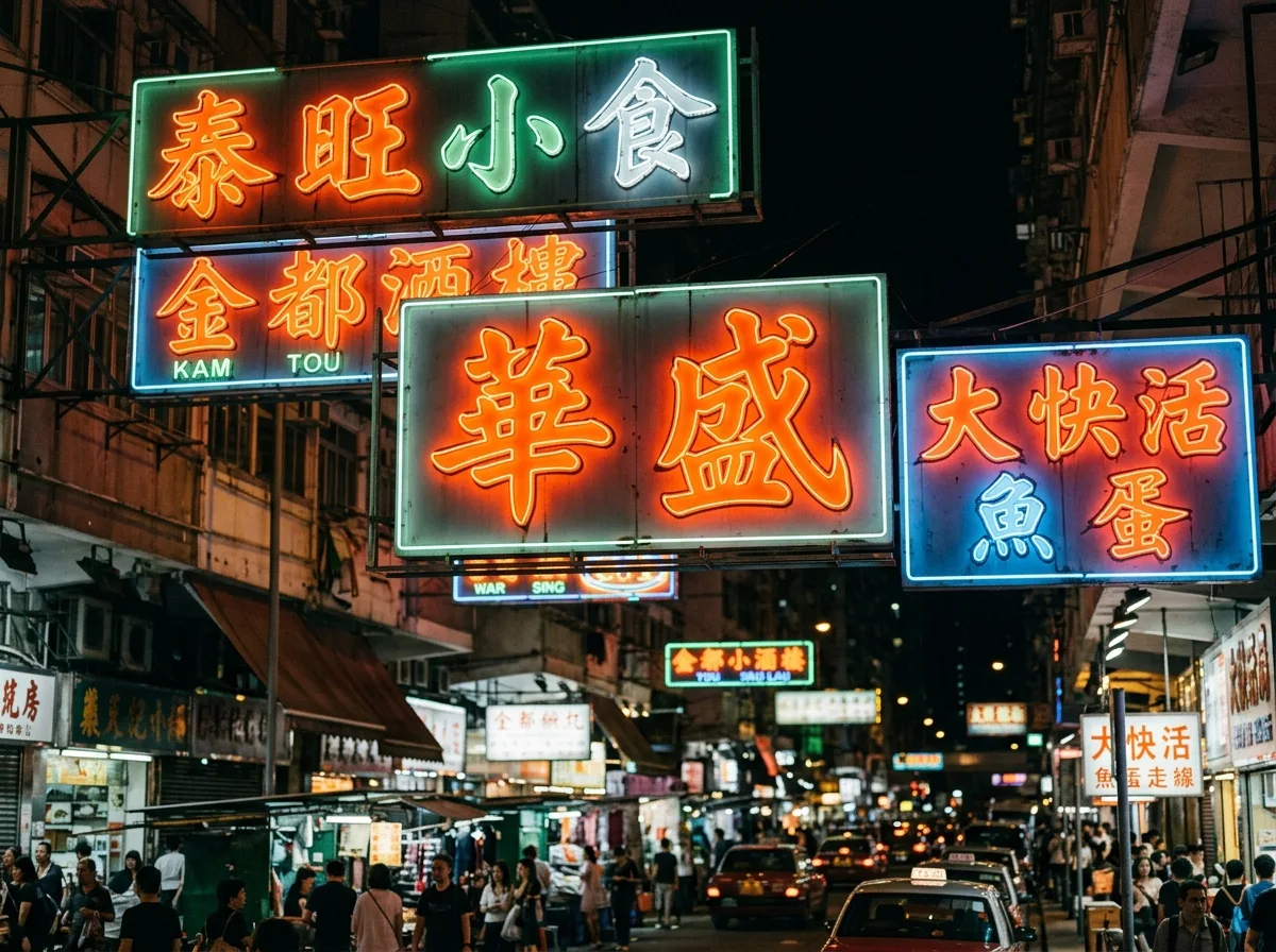
Written in the unique calligraphic style of Hong Kong street signs: exaggerated outward strokes at the beginning and end, upward flicks at the end of horizontal strokes, thick and powerful vertical strokes, with the overall character shape expanding outwards to stand out from a distance and in crowded environments. This typeface originates from the tradition of stele inscriptions, continuously strengthened by sign masters to "be seen among dozens of signs." The calligraphy is first written on paper, then bent into neon tubes by masters or cut into three-dimensional characters from sheet metal. The center of gravity of the characters is high, and the gaps left between strokes are reserved for the routing of neon tubes. Night street view shot from a low angle, with several signs overlapping, the power of the calligraphy enhanced by the light tubes. Avoid: computer font simulation, uniform stroke thickness, characters drawn inwards, neat and non-overlapping arrangement.
Translated from Chinese by AI.
Show the original prompt
以香港街頭招牌特有的書法風格書寫:筆畫起收處外拓誇張、橫畫末端上挑、豎畫粗壯有力,字形整體向外撐開以在遠距離與擁擠的環境中站得住。這種字體來自碑刻的傳統,經由招牌師傅為了「在幾十塊招牌中被看見」而不斷強化。書法先寫在紙上,再由師傅以玻璃管彎製成霓虹或以鐵皮切割成立體字。字的重心偏高,筆畫之間留下的空隙為霓虹管的走線預留。夜間街道仰視拍攝,數面招牌交疊,書法的力度在光管中被強化。避免:電腦字型模擬、筆畫粗細均勻、字形內收、排列整齊不交疊。