Text-to-Image
Interior Design
通用
Baroque vs. Rococo: Grandeur and Lightness
Prompt
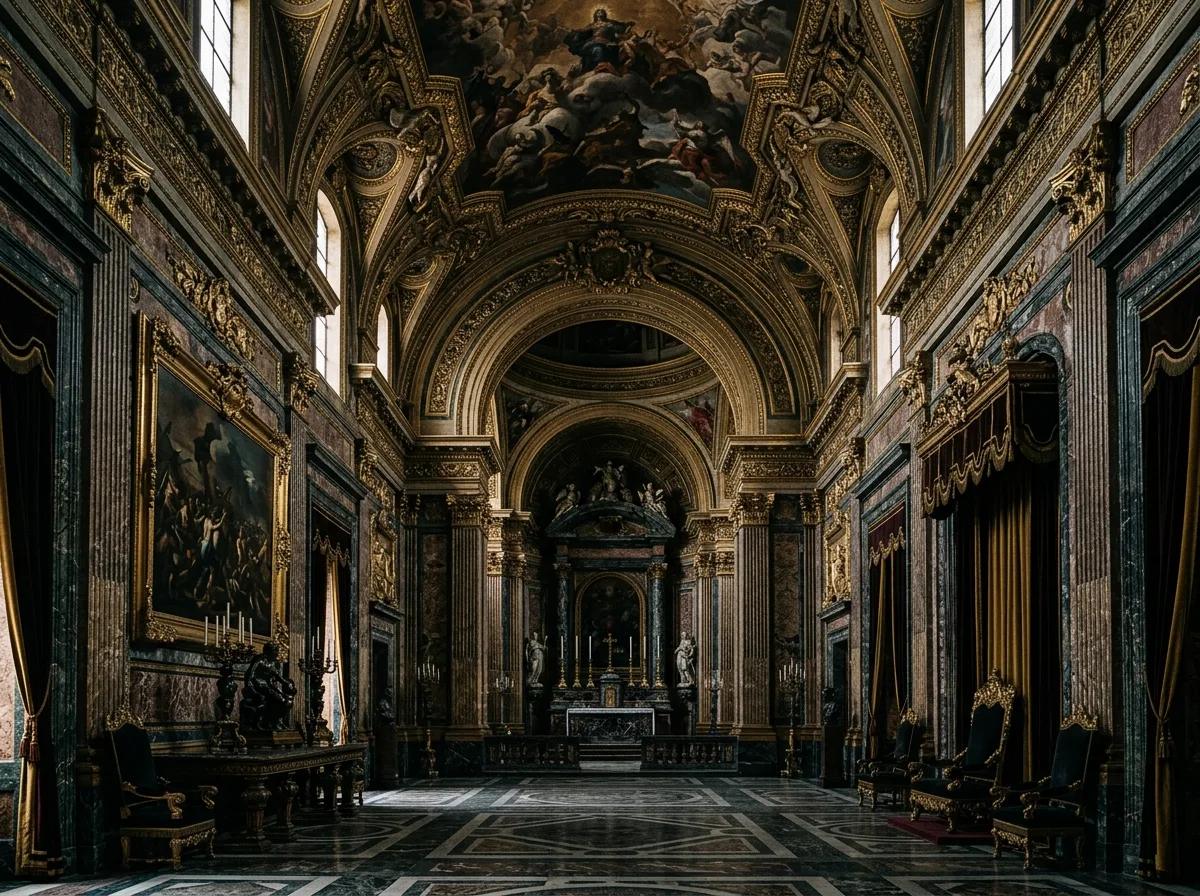
An interior that is clearly Baroque, not Rococo. Baroque is grand and heavy: monumental scale, symmetrical central axis, dark marble and gilding, heavy drapes, religious or mythological frescoes on the ceiling, strong chiaroscuro. Rococo, in contrast, is light and intimate: small rooms, pastel colors, asymmetrical shell motifs, slender curved-leg furniture. The two styles are not mixed. Avoid: adding pastel colors and shell motifs to a Baroque space, reducing the scale to intimate small rooms, using slender light furniture, making the color scheme soft and bright.
Translated from Chinese by AI.
Show the original prompt
一個可以清楚辨認是巴洛克而非洛可可的室內。巴洛克是宏大而沉重的:巨大的尺度、對稱的中軸、深色的大理石與貼金、厚重的帷幔、天花的宗教或神話壁畫、強烈的明暗對比。洛可可則輕巧親密:小房間、粉彩色、不對稱的貝殼捲飾、細瘦的曲腿家具。兩者不混用。避免:在巴洛克空間加入粉彩色與貝殼捲飾、把尺度縮小成親密的小房間、使用細瘦輕盈的家具、讓配色變得柔和明亮。




