Text-to-Image
Interior Design
通用
Desaturated Versions of Historic Green and Historic Blue
Prompt
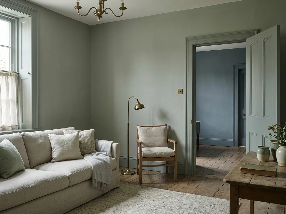
A room primarily featuring softened versions of historical color palettes. The walls and all woodwork are painted a color between sage green and gray—the hue comes from traditional historical green, but its saturation is halved, with a large amount of gray added, so it appears sometimes greenish, sometimes grayish under different lighting. Another room, visible through a doorway, is painted a similarly treated historical blue—a desaturated Prussian blue, like smoky blue. Neither color is vibrant, but neither is a neutral color; they have distinct personalities. Soft furnishings use lighter shades of the same color family as the walls, and oat colors. Metal is unlacquered brass. Avoid: using saturated original historical colors, painting walls pure neutral gray, making woodwork and wall colors different, using high-gloss finishes.
Translated from Chinese by AI.
Show the original prompt
一個以歷史色系的柔化版本為主的房間。牆面與所有木作漆成一種介於鼠尾草綠與灰之間的顏色——色相來自傳統的歷史綠,但彩度被降低了一半,加入了大量的灰,因此在不同的光線下時而偏綠、時而偏灰。另一個房間可以透過門洞看見,漆成同樣處理過的歷史藍——普魯士藍降彩度後的煙灰藍。兩個顏色都不鮮豔,但都不是中性色,有明確的個性。軟裝使用比牆面更淺的同色系與燕麥色。金屬是未上漆的黃銅。避免:使用飽和的歷史原色、把牆面漆成純粹的中性灰、讓木作與牆面顏色不同、使用高光的漆面。




