Text-to-Image
Interior Design
通用
The Manual Itself as Design: Plates, Grids, and Permitted Variations
Prompt
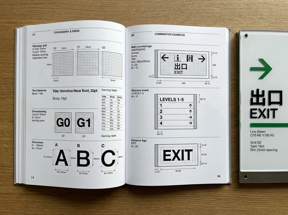
The specification manual itself as design: plates, grids, and allowed variations.
Treat the design drawings of the signage system itself as a visual composition: an open specification manual displays grids, dimension annotations, kerning tables, and various combination examples for different scenarios, with each page arranged according to the same layout rules. The meaning of such a composition is to reveal that "a sign is not a board, but a set of rules"—what is truly designed are the rules, and the physical object is merely an output of those rules. The plates are primarily black and white, with only route colors in color. The paper is matte, and printing is in monochrome and spot colors. Physical signage samples made according to these specifications are placed nearby. Flat lay, top-down shot, with the manual and samples juxtaposed, natural side lighting revealing the paper's thickness and the tactile quality of the printing. Avoid: manual treated as a decorative item, loosely arranged plates, lack of dimension annotations and grids.
Translated from Chinese by AI.
Show the original prompt
把標示系統的設計圖版本身當成畫面:攤開的規範手冊上是網格、尺寸標註、字距表與各種情境下的組合範例,每一頁都以同樣的版面規則排列。這種畫面的意義在於揭示「招牌不是一塊板子,而是一套規則」——真正被設計的是規則,實體只是規則的輸出。圖版以黑白為主,僅路線色為彩色。紙張為霧面,印刷為單色與專色。旁邊放置依此規範製作的實體標示樣板。俯視平拍,手冊與樣板並置,自然側光讓紙的厚度與印刷的凹凸可見。避免:手冊做成裝飾品、圖版排列鬆散、缺少尺寸標註與網格。




