Text-to-Image
Interior Design
通用
Dusty pink and smoky purple: the softness of the eighties
Prompt
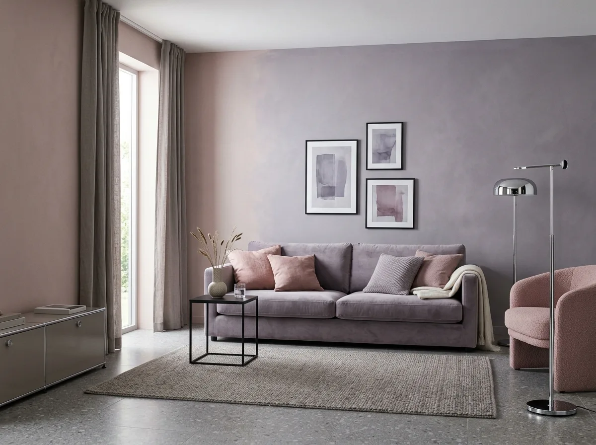
An interior color study focusing on dusty pink and smoky purple. Dusty pink is a light pink with a lot of gray, almost nude, without being overly sweet; smoky purple is a pale purple with gray, like the color of distant mountains. These two colors appear on walls and large soft furnishings, with similar lightness and soft boundaries. The accompanying neutral colors are warm gray and cream. The metal is polished chrome, cold and bright, forming a textural contrast with the soft pink and purple. A small amount of deep charcoal black provides visual weight—a black side table, a set of black frames. The floor is gray terrazzo. The overall impression is soft, low-contrast, with a misty feel. Avoid: using saturated pink and purple, adding warm-toned metals and wood, increasing contrast, using earthy tones.
Translated from Chinese by AI.
Show the original prompt
一個以灰粉與煙燻紫為主的室內色彩研究。灰粉是加了大量灰的淺粉,幾乎接近裸色,沒有甜膩感;煙燻紫則是帶灰的淡紫,像遠山的顏色。這兩色出現在牆面與大型軟裝上,彼此的明度接近,界線柔和。搭配的中性色是暖灰與奶油。金屬是拋光的鍍鉻,冷而亮,與柔和的粉紫形成質感上的對比。少量的深炭黑作為視覺的重量——一張黑色的邊几、一組黑色的框。地面是灰色的磨石子。整體柔和、低對比、有一種霧氣感。避免:使用飽和的粉紅與紫、加入暖色金屬與木質、讓對比變強、使用大地色系。




