Text-to-Image
Interior Design
通用
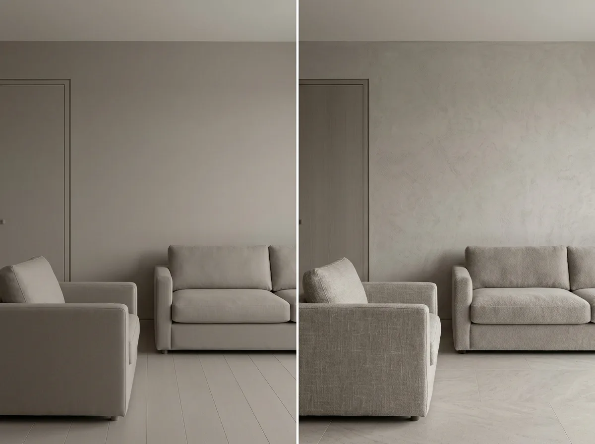
Low contrast does not mean lack of layering
Prompt
Two low-contrast spaces juxtaposed to illustrate the difference. The left side is poorly executed: the lightness is indeed uniform, but the materials are all the same—walls, cabinets, and floors are all the same flat paint, and textiles are also the same plain weave fabric. The result is a flat, uninteresting space that looks unfinished. The right side is well-executed: the lightness is also uniform within three levels, but the textures vary greatly—rough mineral paint, delicate honed stone, short-pile wool, coarse-woven linen, and matte wood. These five textures each present different subtle undulations under diffused light. Therefore, it is low-contrast but not monotonous. The colors and configurations of both are identical. Avoid: making the two versions similar, creating layers with color differences in the correct version, reducing the variety of textures, using hard light to emphasize texture.
Translated from Chinese by AI.
Show the original prompt
兩個都低對比的空間並置,說明差別。左側是做壞的:明度確實統一,但材質也全部一樣——牆、櫃、地板都是同一種平光塗料,織品也是同一種平織布,結果整個空間扁平、無趣、像沒有完工。右側是做對的:明度同樣統一在三階內,但質感差異極大——粗糙的礦物塗料、細緻的珩磨石、短絨的羊毛、粗織的亞麻、霧面的木,五種質地在漫射光下各自呈現不同的細微起伏。因此低對比但不單調。兩者的顏色與配置相同。避免:讓兩者相似、在正確版本用顏色差異製造層次、減少質地的種類、使用硬光突顯質感。




