Text-to-Image
Architecture
通用
Typography: Geometric Shop and Building Names
Prompt
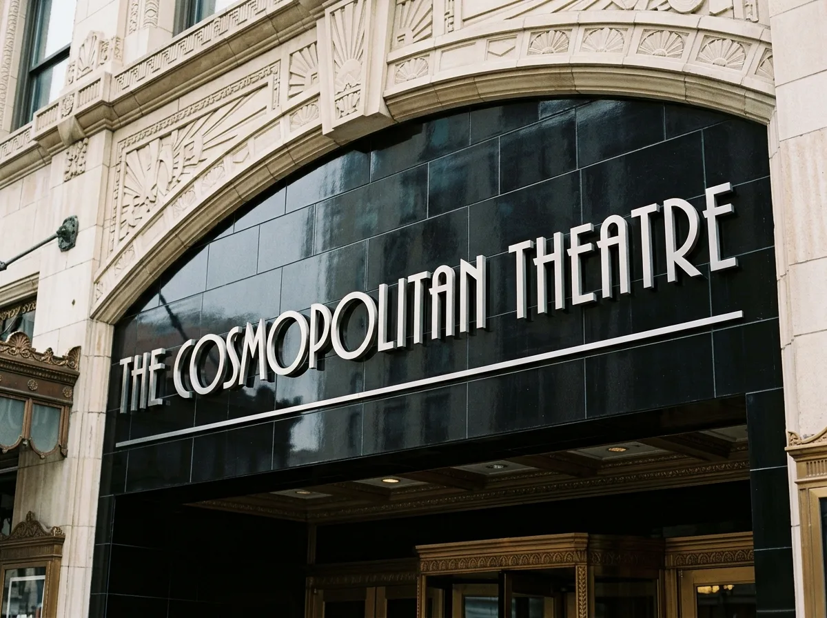
Close-up of metal three-dimensional lettering above the entrance of an Art Deco building. The building's name is rendered in a tall, narrow, geometric sans-serif typeface with strong contrast in stroke weight. The letter O is a perfect circle, and the horizontal strokes of E and F are intentionally set very low. The typeface is made of polished stainless steel, fixed on black glazed ceramic tiles, with a thin horizontal groove line below. Avoid: using Art Nouveau vine-like fonts, using modern brand standard fonts, the typeface being a glowing acrylic light box, messy letter spacing.
Translated from Chinese by AI.
Show the original prompt
一棟裝飾藝術建築入口上方的金屬立體字近景,建築名稱以高而窄的幾何無襯線字體呈現,字母的筆畫粗細對比強烈,O 是完美的正圓,E 與 F 的橫畫刻意壓得很低;字體以拋光的不鏽鋼製作,固定在黑色的釉面陶板上,下方是一道細細的水平溝槽線。避免:使用新藝術的藤蔓字體、使用現代的品牌標準字、字體是發光的壓克力燈箱、字母間距雜亂。