Text-to-Image
Interior Design
通用
Softness Does Not Mean Blurriness
Prompt
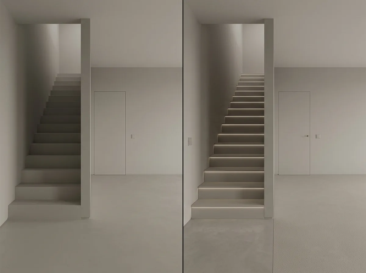
Two low-contrast spaces juxtaposed, illustrating where the boundary lies. On the left is a failed example: the contrast is suppressed too low, leading to functional failure—the height difference of the stair treads is unclear, the door and wall are identical making the entrance hard to find, switches are the same color as the wall and cannot be felt, and there is no indication between the hallway and living room, causing hesitation for people within. On the right is a successful example: the overall space still maintains low contrast, but essential clues are preserved where interpretation is needed—each stair tread has an extremely faint light strip on its side to mark the height difference, the door's location is hinted by a shallow seam, switches are subtly tactilely raised, and the flooring material has a subtle change at area junctions. Softness cannot sacrifice safety and usability. Avoid: making them similar, using high-contrast markings in the successful version, depicting the failed version as completely invisible, changing the spatial layout of either.
Translated from Chinese by AI.
Show the original prompt
兩個低對比空間的並置,說明界線在哪。左側是失敗的:對比壓得太低導致機能失效——樓梯的踏面看不清高低差、門與牆完全一樣找不到入口、開關與牆同色摸不到、走道與客廳沒有任何暗示,人在裡面必須猶豫。右側是成功的:整體仍然低對比,但在需要判讀的地方保留了最低限度的線索——樓梯的每一階側面有一道極弱的燈帶標出高差、門的位置以一道淺縫暗示、開關是可觸摸的微凸、地坪的材質在區域交界處有細微變化。柔和不能犧牲安全與可用。避免:讓兩者相似、在成功版本使用高對比的標示、把失敗版本畫成完全看不見、改變兩者的空間配置。




