Text-to-Image
Interior Design
通用
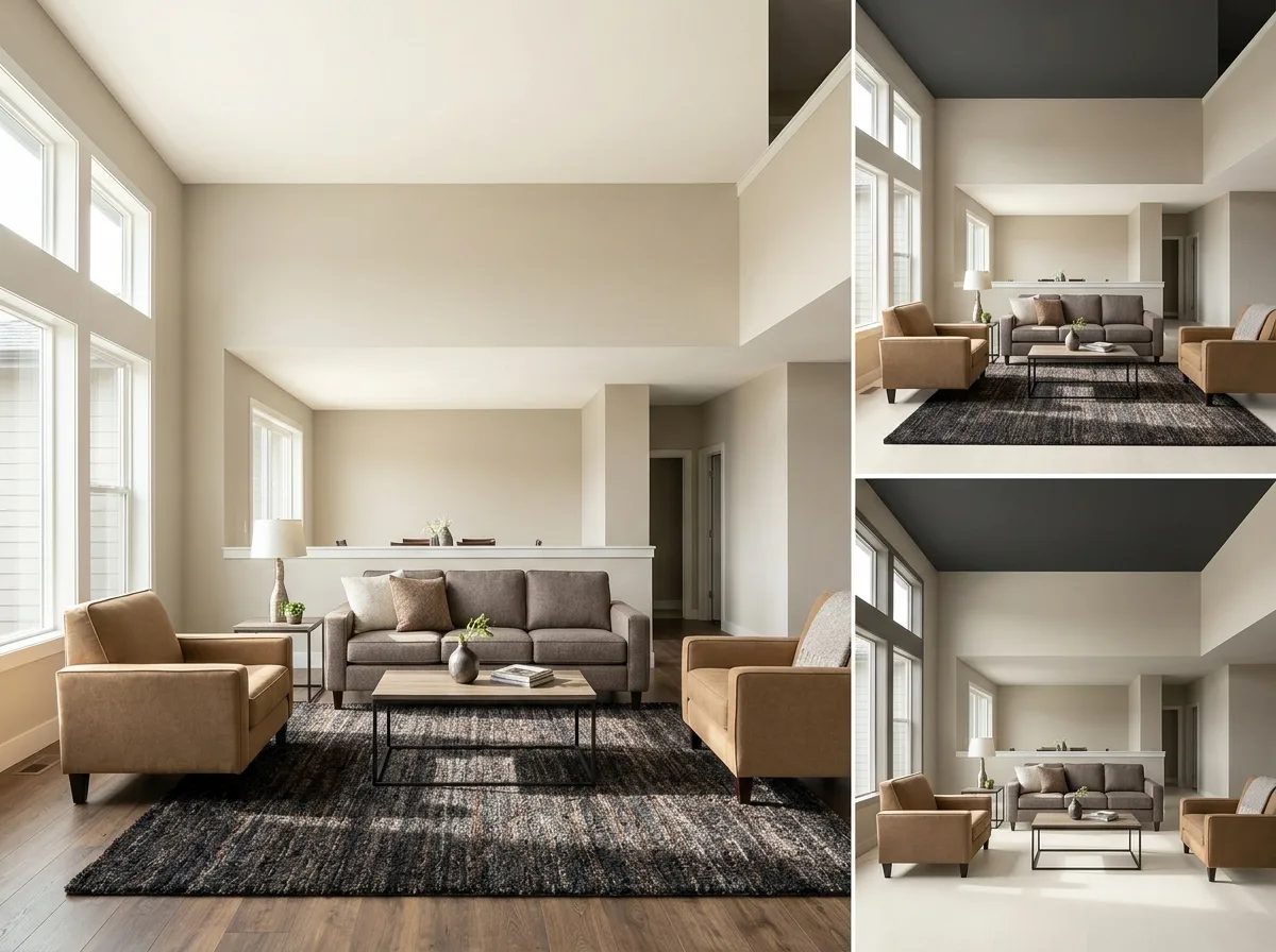
Using Dark Colors: Weight at the Bottom
Prompt
A space demonstrating luminosity distribution. The lightness and darkness of colors are distributed according to height: the ceiling is the lightest – warm white; the walls are next – oatmeal; the soft furnishings of the furniture are mid-tone camel and grayish-brown; the rug and floor are the darkest – deep charcoal and medium brown. Thus, the visual center of gravity of the space is stably located at the bottom, making people feel grounded within it. In one corner of the image, an inverted version is shown for comparison: a dark ceiling and light floor, making the space immediately appear top-heavy, oppressive, and unsettling. The color types and materials of both versions are completely identical; only their distribution positions are swapped. Avoid: making the two versions similar, using a dark ceiling in the correct version, making the lightness differences between the four layers indistinct, changing the color types and materials.
Translated from Chinese by AI.
Show the original prompt
一個示範明度分佈的空間。顏色的深淺依高度分佈:天花最淺——暖白;牆面次之——燕麥;家具的軟裝是中間調的駝與灰褐;地毯與地板最深——深炭與中褐。因此空間的視覺重心穩定地落在下方,人在裡面感覺踏實。畫面一角以顛倒的版本作對照:深色的天花、淺色的地面,空間立刻顯得頭重腳輕、壓迫而不安。兩者的顏色種類與材質完全相同,只有分佈的位置對調。避免:讓兩者相似、在正確版本使用深色天花、讓四個層次的明度差距不明顯、改變顏色的種類與材質。




