Text-to-Image
Architecture
通用
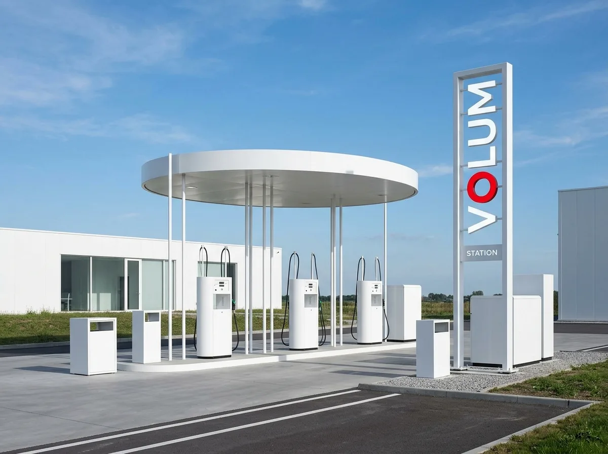
Mobil Gas Station Design Project: Circular Canopy and the System of the Red O
Prompt
Redesigning brand identity and architecture together: the fuel dispensers are white cylindrical bodies, the canopies are clean circular or square white plates, with extremely thin supports, making the whole resemble a set of industrial products rather than architecture. Signage consists only of the brand name in a sans-serif font, with the letter O in one of the words being a saturated red—this single red dot is the only chromatic accent in the entire system. All elements (fuel dispensers, canopies, signposts, trash cans) adopt the same geometric and material language. The overall impression is clean, geometric, and unadorned. Daytime shot, with white volumes under a blue sky, and the red O as the only high-chroma point in the frame. Avoid: multi-color schemes, decorative roofs, oversized signboards, or inconsistent language between elements.
Translated from Chinese by AI.
Show the original prompt
把品牌識別與建築一起重新設計:加油機為白色的圓柱體,雨庇為乾淨的圓形或方形白色板,支柱極細,整體像一組工業產品而非建築。標示只有品牌名的無襯線字,其中一個字母的 O 為飽和的紅色——這一個紅點是整個系統唯一的色彩重音。所有元素(加油機、雨庇、標示柱、垃圾桶)採用同一套幾何與材質語言。整體白淨、幾何、無裝飾。日間拍攝,白色量體在藍天下,紅色 O 為畫面唯一的高彩度點。避免:多色配色、裝飾性屋頂、標示板過大、元素之間語言不一致。