Text-to-Image
Interior Design
通用
Difference from American Pop: Less Imagery
Prompt
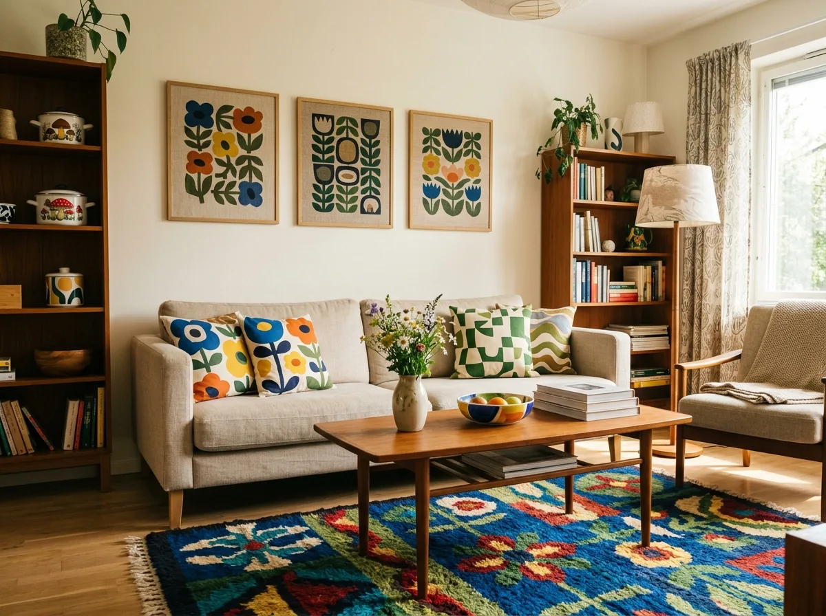
An interior that is Nordic Pop, not American Pop. American Pop uses images from consumer culture: comic book halftones, product packaging, celebrity portraits, advertising fonts. Here, none of these are present; patterns are abstract flowers and geometries, derived from textile design rather than print media. There are no texts or identifiable images in the space. The overall feel is natural and everyday, rather than urban and media-driven. Avoid: adding comic book halftones and Pop Art reproductions, using logos and text patterns, adding celebrity portraits and posters, using graphics that feel like print media.
Translated from Chinese by AI.
Show the original prompt
一個是北歐普普而非美式普普的室內。美式普普用的是消費文化的圖像:漫畫網點、商品包裝、名人肖像、廣告字體。這裡完全沒有這些;圖案是抽象的花朵與幾何,來自織品設計而不是印刷媒體。空間裡沒有任何文字與可辨識的圖像。整體是自然的、日常的,而不是都市與媒體的。避免:加入漫畫網點與普普藝術的複製畫、使用商標與文字圖案、加入名人肖像與海報、使用印刷媒體感的圖形。




