Text-to-Image
Interior Design
通用
Saturated but not glaring: colors should be slightly powdery
Prompt
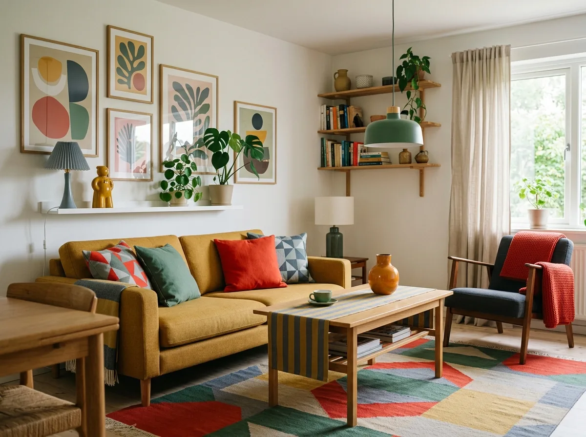
A Nordic Pop space with saturated but not harsh colors. The colors have high chroma but are not pure primary colors; instead, they are versions with a touch of white or black: mustard yellow instead of lemon yellow, tomato red instead of true red, duck green instead of emerald green, and gray-blue instead of royal blue. This makes the colors appear warm and not obtrusive next to white walls and wood, suitable for long-term living. Avoid: using pure primary colors and fluorescent colors, reducing colors to low-chroma Morandi tones, using contemporary high-saturation neon colors, making the colors appear cheap and harsh.
Translated from Chinese by AI.
Show the original prompt
一個顏色飽和但不刺眼的北歐普普空間。顏色的彩度很高,但都不是純正的原色,而是加了一點白或一點黑的版本:芥末黃而不是檸檬黃、番茄紅而不是正紅、鴨綠而不是翠綠、灰藍而不是寶藍。這讓顏色在白牆與木頭旁邊顯得溫暖而不突兀,適合長時間居住。避免:使用純正的三原色與螢光色、把顏色降到低彩度的莫蘭迪調、使用當代的高飽和霓虹色、讓顏色顯得廉價刺眼。




