Text-to-Image
Interior Design
通用
Three Signs You're Doing Pop Nordic Wrong
Prompt
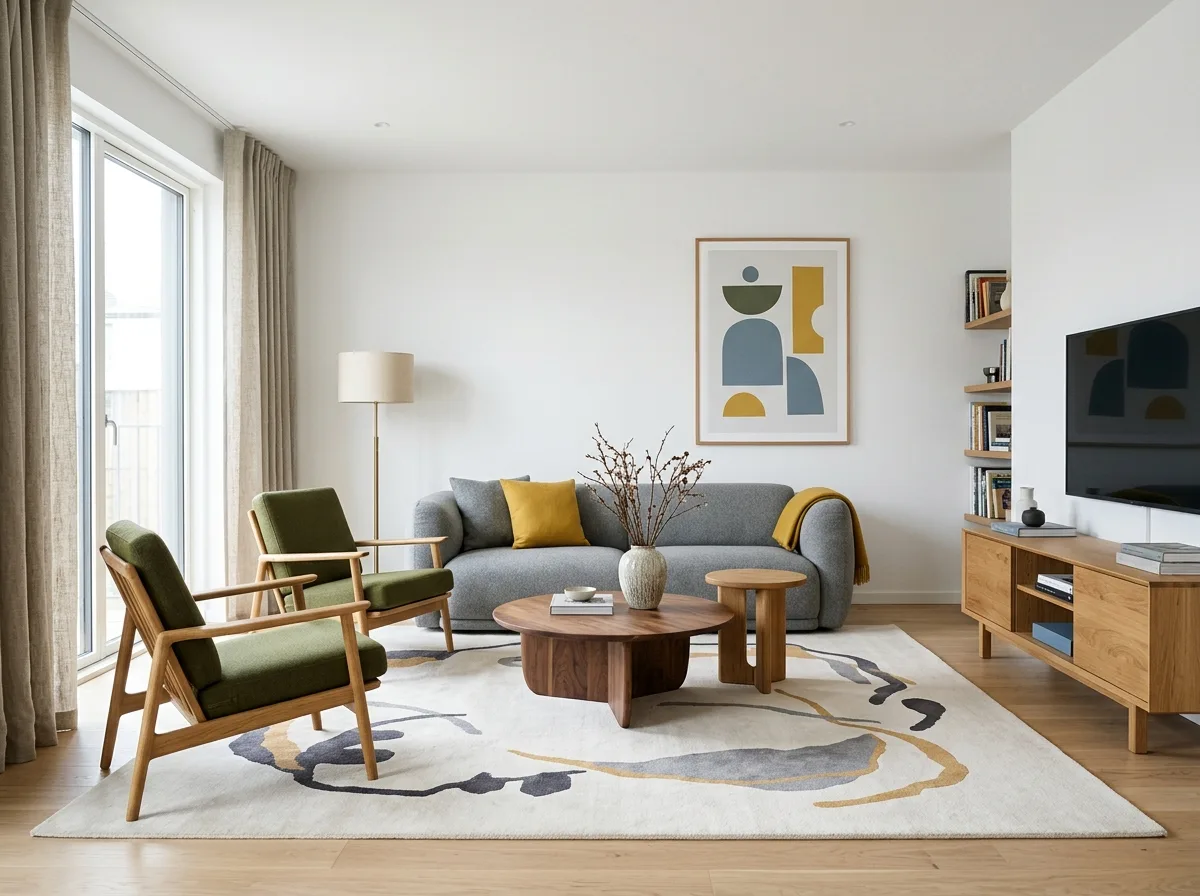
A Nordic Pop interior that avoids three common failures. First, not noisy: patterns are limited to one area, and white occupies more than 40% of the space. Second, not cheap: furniture is made of solid wood and thick textiles, not plastic-like imitations; colors are desaturated with gray rather than pure primary colors. Third, not like a children's space: furniture proportions are adult-sized, and color combinations are limited to three or fewer. Overall pleasant but mature.
Avoid: having multiple surfaces simultaneously use patterns, using pure red, yellow, and blue primary colors, using a large amount of cheap plastic products, increasing the number of colors to five or six.
Translated from Chinese by AI.
Show the original prompt
一個避開三種常見失敗的北歐普普室內。第一,不吵:圖案只有一處,白色的面積佔四成以上。第二,不廉價:家具是實木與有厚度的織品,不是塑膠感的仿製品;顏色是加了灰的飽和色而不是純原色。第三,不像兒童空間:家具的比例是成人的,顏色的組合克制在三個以內。整體愉快但成熟。避免:讓多個平面同時使用圖案、使用純正的紅黃藍三原色、使用大量廉價的塑膠製品、把顏色的數量增加到五六種。




