Text-to-Image
Interior Design
通用
Fat Design Done Wrong
Prompt
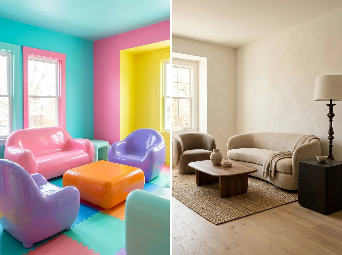
A comparison demonstrating common mistakes. The poorly executed version is: the entire room is filled with high-saturation candy colors, turning the space into a playground; each piece of furniture is plump in a different way, causing them to clash; rounded volumes are made with glossy plastic, turning it into a children's furniture store; everything is round but nothing is dark, making the image blurry and lacking a focal point. The correct approach is consistent forms, reduced saturation, authentic materials, and a dark element to anchor the scene. Avoid: filling the entire room with high-saturation candy colors, making the roundness of each piece of furniture inconsistent, using glossy plastic and ABS materials, making the image lack a dark anchor point.
Translated from Chinese by AI.
Show the original prompt
一個示範常見錯誤的對照。做壞的版本是:全室都是高彩度的糖果色讓空間變成遊戲場;每一件家具的胖法都不一樣導致互相打架;把圓潤的量體做成塑膠亮面變成兒童家具賣場;所有東西都圓卻沒有一件是深色的,畫面因此糊成一團沒有重心。正確的做法是形體一致、彩度降低、材料真實、留一個深色壓住。避免:使用高彩度的糖果色鋪滿全室、讓每件家具的圓潤程度不一致、使用亮面塑膠與 ABS 材質、讓畫面缺少一個深色的錨點。




