Text-to-Image
Architecture
通用
Global Flagship Store Identity: Katakana Blocks and Facade Repetition
Prompt
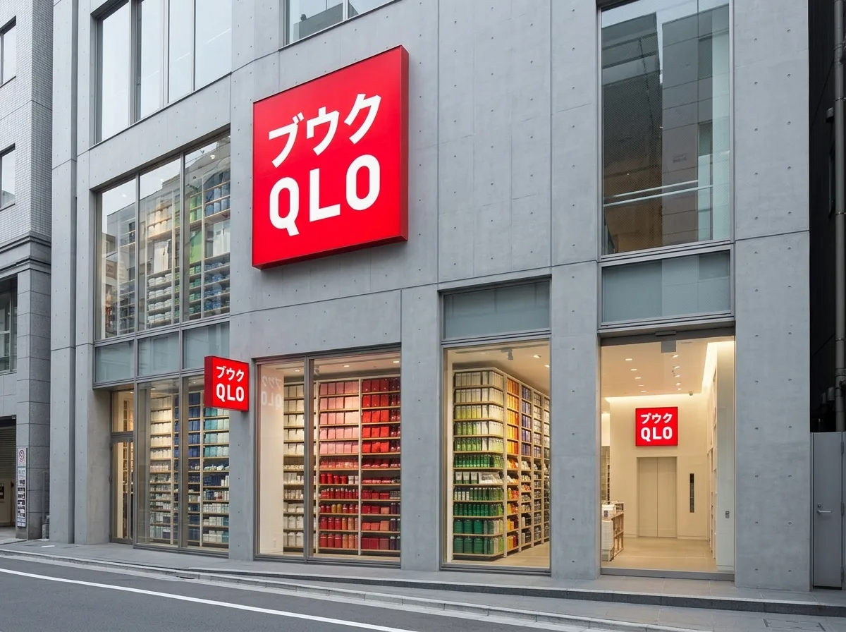
Based on a saturated red square, white katakana and Latin letters are juxtaposed vertically within the square, with both writing systems given equal weight—this decision of "no translation, coexistence of both" is the entire premise of the identity. The squares appear repeatedly on the architecture at a large scale: at the top of the facade, at the corners of display windows, and on the walls of elevator lobbies. Their size is graded according to distance, but their proportion is always consistent. The in-store display also adopts a grid and repetition logic, with a large number of same-colored products densely arranged into color blocks. The overall impression is clean, dense, and systematic. Street-level frontal shot, with the red squares standing out prominently against the gray-white facade. Avoid: distorted squares or added shadows, retaining only one type of text, diverse color schemes, or loose displays.
Translated from Chinese by AI.
Show the original prompt
以一個飽和的紅色正方形為基礎,方塊內以白色的片假名與拉丁字母上下並置,兩種文字系統擁有同等的份量——這個「不翻譯、兩者並存」的決定就是識別的全部主張。方塊在建築上以大尺度重複出現:立面的頂端、櫥窗的邊角、電梯廳的牆面,尺寸依距離分級但比例永遠一致。店內的陳列同樣採用網格與重複的邏輯,大量同色商品密集排列成色塊。整體乾淨、密集、系統化。街道正面拍攝,紅色方塊在灰白的立面上格外突出。避免:方塊變形或加陰影、只保留一種文字、配色多樣、陳列鬆散。