Text-to-Image
Interior Design
通用
The Divide Between Quiet Luxury and Light Luxury: Real Materials vs. Imitation Materials
Prompt
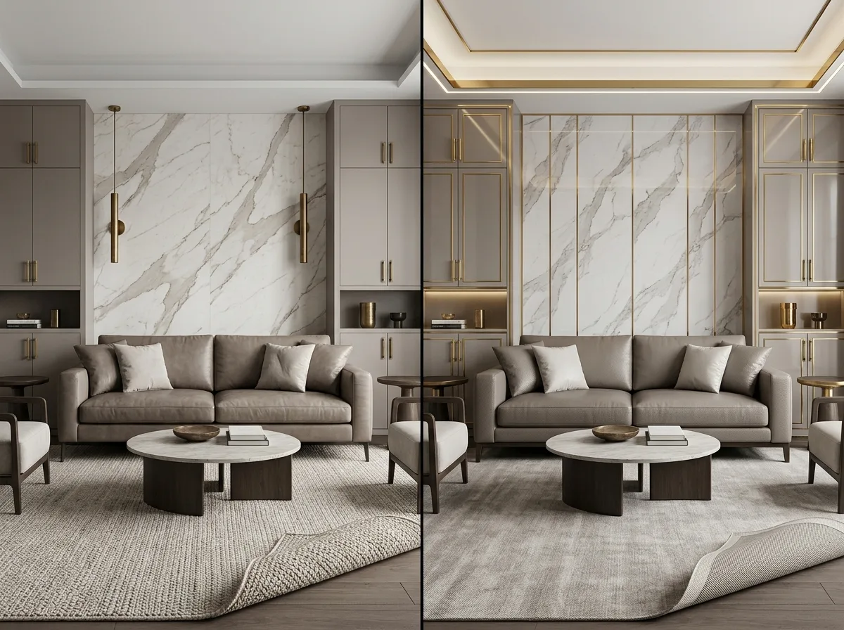
Two spaces with similar appearances are juxtaposed for comparison. The left side represents quiet luxury: natural marble with continuous, non-repeating veins, solid brass hardware that oxidizes with use, full-grain leather with natural pores, and a handmade wool rug with visible knots on the back; colors are low-chroma, with no decorative lines. The right side represents light luxury: laminate with faux stone patterns that repeat every four pieces, bright gold-plated titanium hardware with worn edges, corrected-grain leather pressed with uniform artificial textures, and a machine-woven rug with a glued mesh backing; additionally, a large number of brass thin lines and light strips are added to emphasize a sense of luxury. The color schemes and layouts of both are almost identical, the difference lies in the authenticity of the materials and whether decorative lines are needed to support the aesthetic. Avoid: making the two too similar, replacing material differences with color differences, depicting light luxury as obviously cheap and worn, changing the spatial arrangement of the two.
Translated from Chinese by AI.
Show the original prompt
兩個外觀相似的空間並置對照。左側是安靜奢華:天然大理石的脈絡連續不重複、實心黃銅的五金隨使用氧化、全粒面皮革有天然毛孔、手工羊毛地毯背面看得見結;顏色低彩度、沒有裝飾線條。右側是輕奢:仿石紋的美耐板每四片重複一次圖案、鍍鈦的亮金五金邊角已經磨損、修面皮壓著均勻假紋、機織地毯背面是膠合網布;並且加了大量的黃銅細線與燈帶來強調高級感。兩者的配色與配置幾乎相同,差別在材料的真假與是否需要靠裝飾線條撐場。避免:讓兩者相似、用顏色差異取代材料差異、把輕奢畫成明顯廉價破舊、改變兩者的空間配置。




