Text-to-Image
Interior Design
通用
New York Subway Signage Standards: The Rules of Black Background, White Text, and Arrows
Prompt
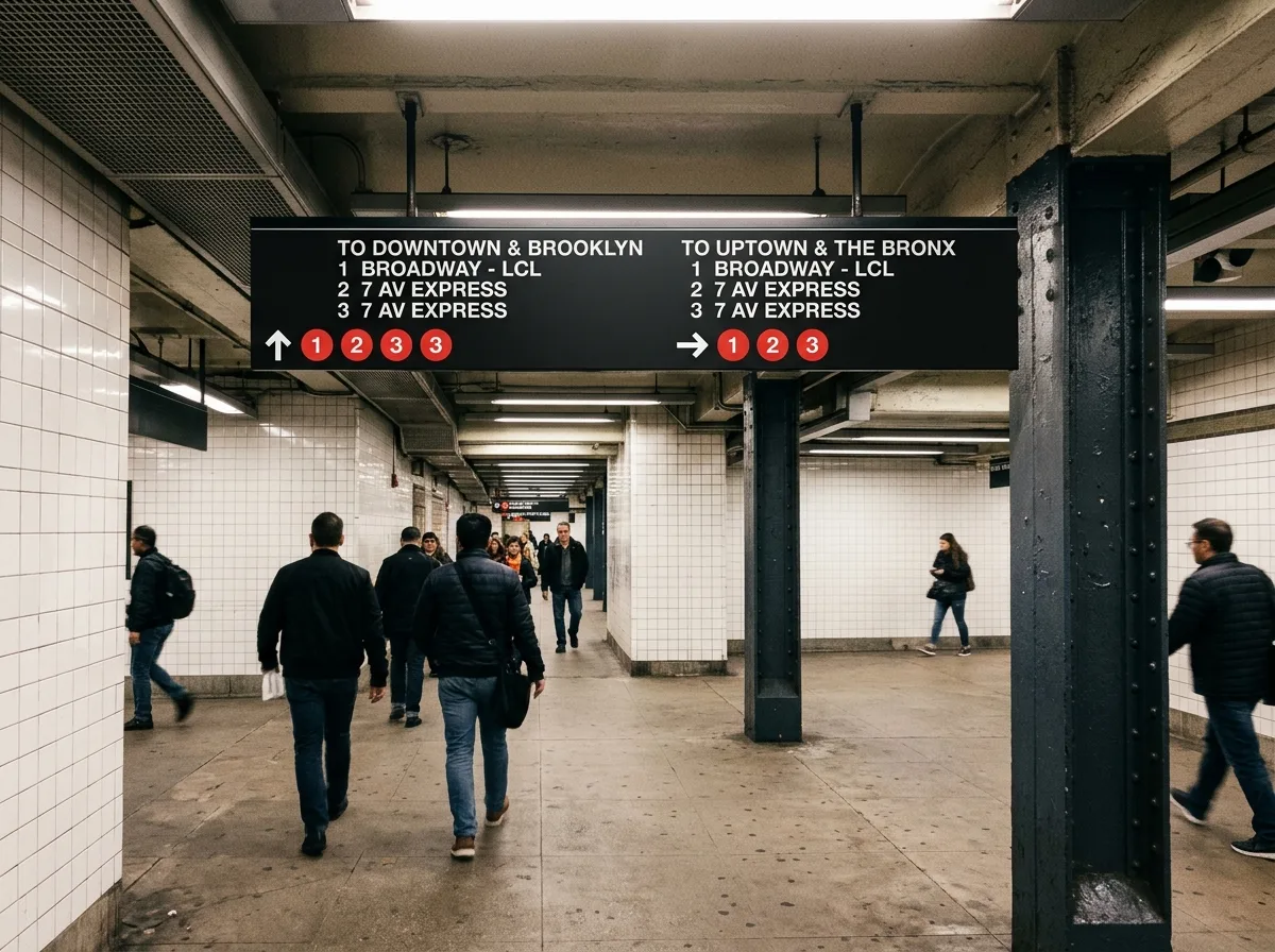
New York Subway Signage Standards: The rules of black background, white text, and arrows.
Design subway station signage according to the standards established by Vignelli and Unimark: black background, white Helvetica, routes indicated by colored circular symbols, and arrows always pointing in the actual direction of travel, not an abstract "this way." Signage is suspended below the ceiling, with placement determined by decision points—wherever people need to make a choice, signage appears, no more, no less. Text is left-aligned, with line spacing and letter spacing fixed by the standards. No superfluous lines or decorations are placed on the signboards. The value of the entire system lies in "providing absolute consistency in a chaotic environment." Wide-angle shot inside the station, with tiled walls, steel columns, and suspended black signboards forming a contrast. Avoid: multiple fonts, center alignment, added borders, signage placement unrelated to decision points.
Translated from Chinese by AI.
Show the original prompt
以維涅里與 Unimark 訂立的規範設計地鐵站內標示:黑色底板、白色 Helvetica、路線以彩色圓標表示,箭頭永遠指向實際行進的方向而非抽象的「這邊」。標示懸掛在天花下方,位置由決策點決定——人在哪裡需要做選擇,標示就在哪裡出現,不多不少。文字左對齊,行距與字距由規範固定。板面上不放任何多餘的線條或裝飾。整個系統的價值在於「在混亂的環境中提供絕對的一致」。站內廣角拍攝,磁磚牆、鋼柱與懸掛的黑色標示板形成對比。避免:多種字體、置中對齊、加框線、標示位置與決策點無關。




