Text-to-Image
Interior Design
通用
Material warmth: the difference in white
Prompt
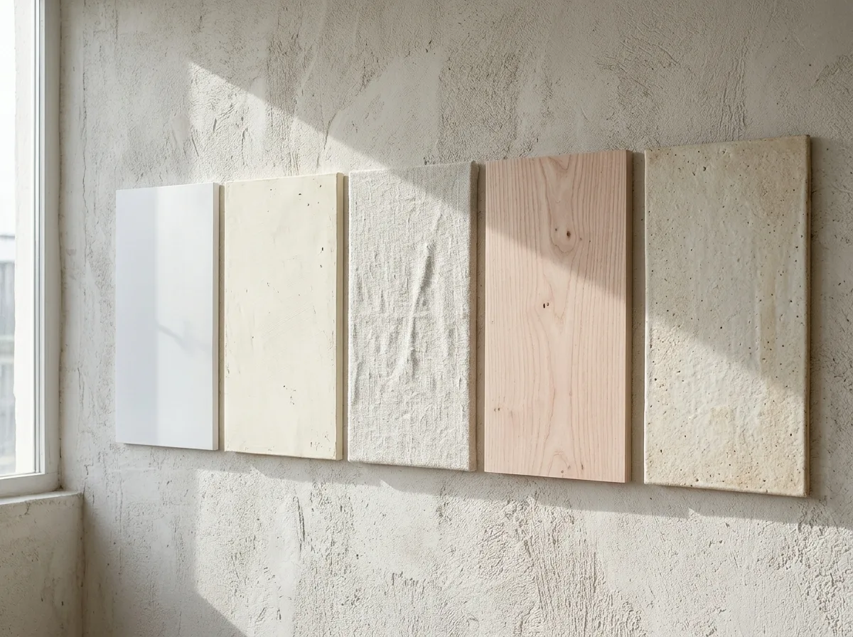
A side-by-side comparison of a set of white materials. The same wall is divided into several sections, presenting different whites: smooth white spray-painted panels, with a uniform, slightly reflective, cold-to-the-touch surface; hand-troweled lime plaster, a yellowish warm white, with subtle undulations and trowel marks, absorbing light; coarsely woven natural linen, a grayish off-white, soft and textured with shadows; unpainted white ash wood, a pinkish light brown-white, with visible wood grain; handmade white clay, with granular surface and firing color variations. Their lightness is similar, but due to differences in texture and color temperature, they give completely different sensations of warmth—the rougher, less reflective, and more yellowish, the warmer. Light strikes at a grazing angle. Avoid: making all materials look the same, using cool white and pure white, eliminating textural differences, using uniform frontal lighting.
Translated from Chinese by AI.
Show the original prompt
一組白色材料的並置比較。同一面牆上分成幾塊,呈現不同的白:噴漆的平滑白色板材,表面均勻、微微反光、觸感冰冷;手工抹製的石灰塗料,帶黃的暖白,表面有細微起伏與抹痕,吸光;粗織的原色亞麻布,是帶灰的米白,質地鬆軟有陰影;未上漆的白蠟木,是帶粉的淺褐白,可見木紋;手作的白色陶土,表面有顆粒與燒製的色差。它們的明度接近,但因為質地與色溫不同,給人的溫度感完全不同——越粗糙、越不反光、越偏黃的越暖。光以掠射角度打過來。避免:讓所有材料看起來相同、使用冷白與純白、消除質地的差異、使用正面均勻打光。




