Text-to-Image
Interior Design
通用
Fake Old: The Most Attacked Aspect of This Style
Prompt
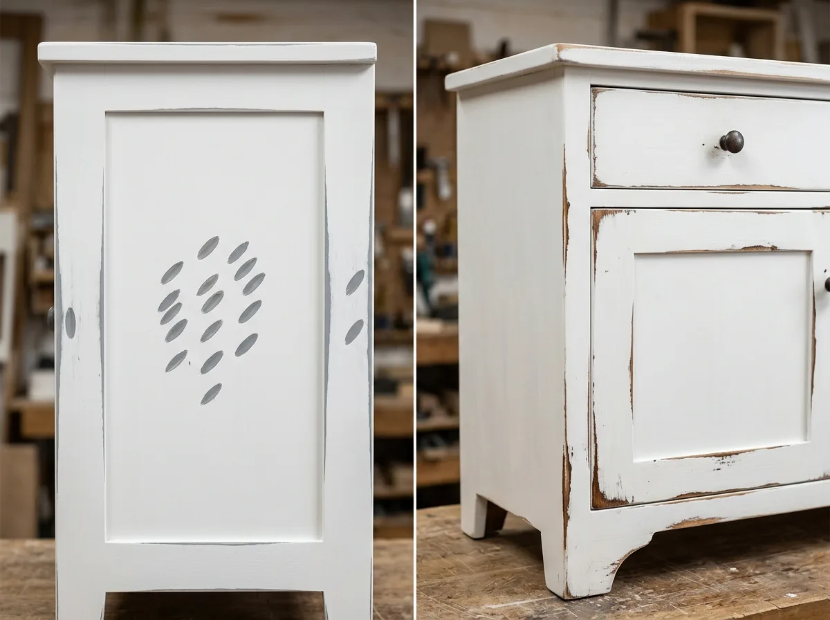
Fake distressing: the most common criticism of this style.
Two close-up comparisons of white-painted wooden cabinets, illustrating the success or failure of distressing. The left side is poorly done: wear appears in unreasonable locations—the center of the cabinet door, the middle of a flat surface, and unseen areas on the back; the abrasion marks are regular ovals, consistent in direction, clearly machine-made; and after wearing through, a gray primer is exposed instead of wood. The right side is correctly done: wear only appears where hands would genuinely touch and objects would genuinely bump—around handles, the bottom edge of doors, the edges of drawers, within ten centimeters of the floor on cabinet legs, and the front edge of tabletops; the depth of the abrasion marks is irregular, revealing warm old wood tones. Avoid: making the two look identical, increasing the area of wear in the correct version, having abrasion marks expose gray primer, distributing wear evenly.
Translated from Chinese by AI.
Show the original prompt
兩張漆白木櫃的近景對照,說明做舊的成敗。左側是做壞的:磨損出現在不合理的位置——櫃門正中央、平面的中間、背面看不到的地方;磨痕的形狀是規則的橢圓、方向一致,一看就是用機器打的;而且磨穿之後露出的是灰色的底漆而不是木頭。右側是做對的:磨損只出現在手真的會碰到與物體真的會撞到的位置——把手周圍、門的下緣、抽屜的邊、櫃腳離地十公分內、桌面的前緣;磨痕的深淺不規則,露出的是溫暖的舊木色。避免:讓兩者看起來相同、在正確版本增加磨損的面積、讓磨痕露出灰色底漆、把磨損分佈得均勻。




