Text-to-Image
Interior Design
通用
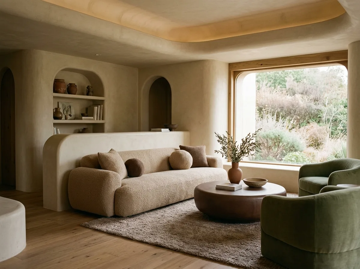
Earthy tones for the fat ones: not just pink can be used
Prompt
A "chubby" space with absolutely no pink. The color scheme is changed to earth tones: oatmeal, milk tea, terracotta, moss green, and cocoa, all with very low saturation. The forms are still round and thick, but the overall impression is warm and stable rather than sweet, suitable for users who don't want a childlike feel. This proves that the core of this style is proportion, not color. Avoid: adding any pastels, using high-saturation accent colors, making the color scheme too monotonous without layers of brightness, or changing the forms to be angular.
Translated from Chinese by AI.
Show the original prompt
一個完全沒有粉色的胖空間。配色改成大地色系:燕麥、奶茶、陶土、苔綠與可可,彩度同樣很低。形體還是一樣的圓與厚,但整體讀起來是溫暖沉穩的而不是甜的,適合給不想要童趣感的使用者。這證明這個風格的核心是比例不是顏色。避免:加入任何粉彩色、使用高彩度的重點色、讓配色變得過於單調沒有明度層次、把形體也一起改成方正的。




