Text-to-Image
Architecture
通用
Museum Grid Fonts: Poster-Style Architectural Signage
Prompt
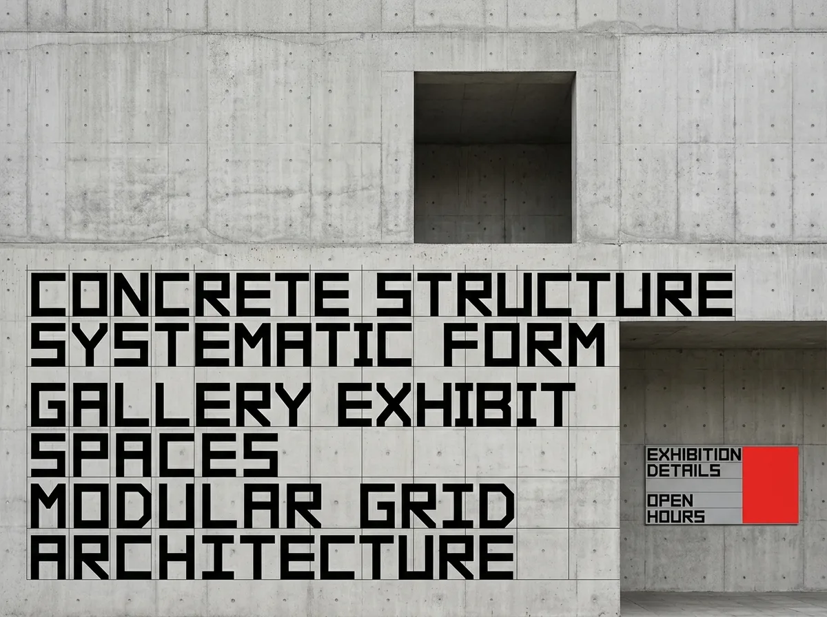
Typography based solely on a grid: letters composed of lines of uniform thickness and minimal diagonals, with right-angle corners, almost no curves, strictly adhering to grid rules. All arrangements—letter spacing, line spacing, and the positions of images and text—are determined by the same grid system, with no exceptions allowed. This language extends from museum posters to architectural signage: giant letters are directly suspended or painted on the facade, in a black and white color scheme, occasionally accented with a single vibrant monochrome. The overall impression is rational, calm, and systematic. Frontal, eye-level composition, strictly corrected for horizontal and vertical alignment. Avoid: curved fonts, multiple font weights, centered alignment, shadows, and 3D effects.
Translated from Chinese by AI.
Show the original prompt
以網格為唯一依據的排印:字母由粗細一致的直線與極少的斜線構成,轉角為直角,幾乎沒有曲線,完全服從方格的規則。所有的排列——字距、行距、圖與文的位置——都由同一個方格系統決定,不允許例外。這套語言從美術館的海報延伸到建築的標示:巨大的字直接懸掛或漆在立面上,黑白配色,偶爾以一個鮮豔的單色作為重音。整體理性、冷靜、系統化。正面平視、嚴格校正水平垂直的構圖。避免:曲線字體、多種字重、置中對齊、加陰影與立體效果。