Text-to-Image
Interior Design
通用
Three Display Heights: Eye, Hand, and Foot
Prompt
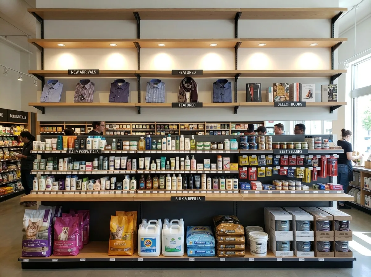
Three display heights: eye, hand, and foot. On the same wall, divide the work into three heights: at eye level, place the best-selling and new products, facing outwards, with the largest spacing and strongest lighting; at hand-reachable mid-level, place main products and items that need to be picked up and viewed, with denser shelves; below knee level, place spare items, large packages, and low-priced refills, with deep shelves and minimal lighting. The shelf depths for the three sections differ, shallower at the top and deeper at the bottom, creating a visual slope on the wall instead of a flat surface. The font size of labels also changes with height. This principle applies to any store type—apparel, cosmetics, bookstores, hardware, all the same. Shot facing the wall during the day, the differences in shelf depth, lighting intensity, and product density across the three heights are simultaneously visible. Avoid: all shelves of equal depth and spacing, uniform lighting across the entire wall, main products placed below knee level, consistent label font size.
Translated from Chinese by AI.
Show the original prompt
同一面牆用三種高度分工:視線的高度放最想賣的與新品,商品正面朝外、間距最大、打光最強;伸手可及的中段放主力與需要拿起來看的東西,層板較密;膝蓋以下放備品、大包裝與低單價的補充品,層板深而少打光。三段的層板深度不同,上淺下深,視覺上牆面因此有斜度而不是平的一片。標示的字級也隨高度改變。這個原則適用於任何店型——服飾、藥妝、書店、五金都一樣。日間正對牆面拍攝,三段高度的層板深度差異、打光強弱與商品密度同時可見。避免:所有層板等深等距、全牆均勻打光、主力商品放在膝蓋以下、標示字級一致。




