Text-to-Image
Interior Design
通用
Material Contrast: Hard vs. Soft, Glossy vs. Matte
Prompt
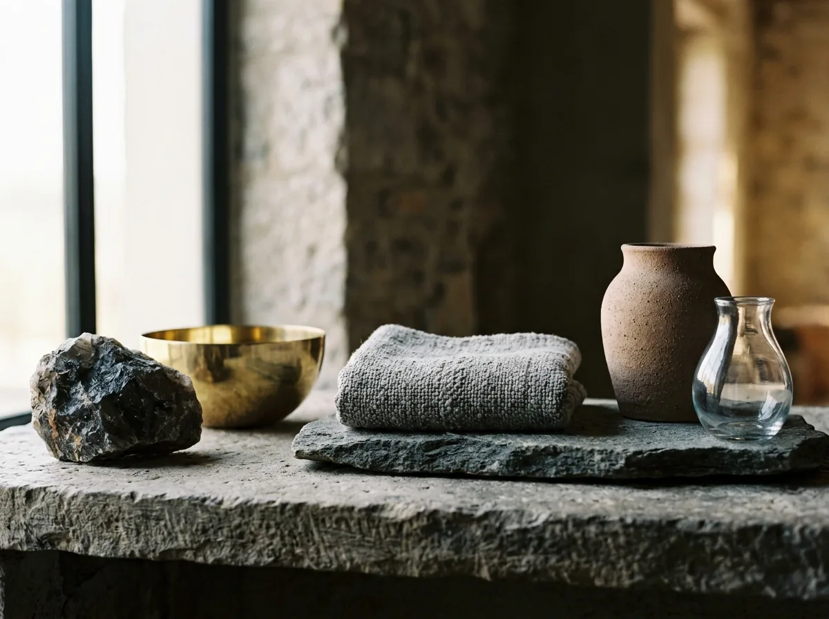
An arrangement deliberately contrasts materials: a rough natural stone next to polished brass, a soft textile under a hard stone surface, a matte ceramic next to transparent glass. Because of the significant textural differences, even if the colors are all in the same low-saturation palette, the objects still stand apart. Conversely, if everything were matte ceramic and wood, the entire group would blend together. The image shows a close-up of three contrasting combinations, two items per group. Single-direction side lighting maximizes the difference in how different materials react to light. Avoid: all objects using similar textures, distinguishing by color rather than material, using uniform diffused light, shooting from a distance where texture is not visible.
Translated from Chinese by AI.
Show the original prompt
一組陳設刻意讓材質互相對比:一塊粗糙的原石旁邊是拋光的黃銅、一件柔軟的織品下面是堅硬的石材檯面、一只霧面的陶器旁是透明的玻璃。因為質感差異大,即使顏色都在同一個低彩度的色系裡,物件之間仍然分得開。反過來說,如果全部都是啞光的陶與木,整組會糊成一片。畫面以近景呈現三組對比的組合,每組兩件。單一方向的側光,讓不同材質對光的反應差異最大化。避免:所有物件使用相似的質感、靠顏色而非材質區分、使用均勻的散射光、拍成遠景看不出質地。




