Text-to-Image
Interior Design
通用
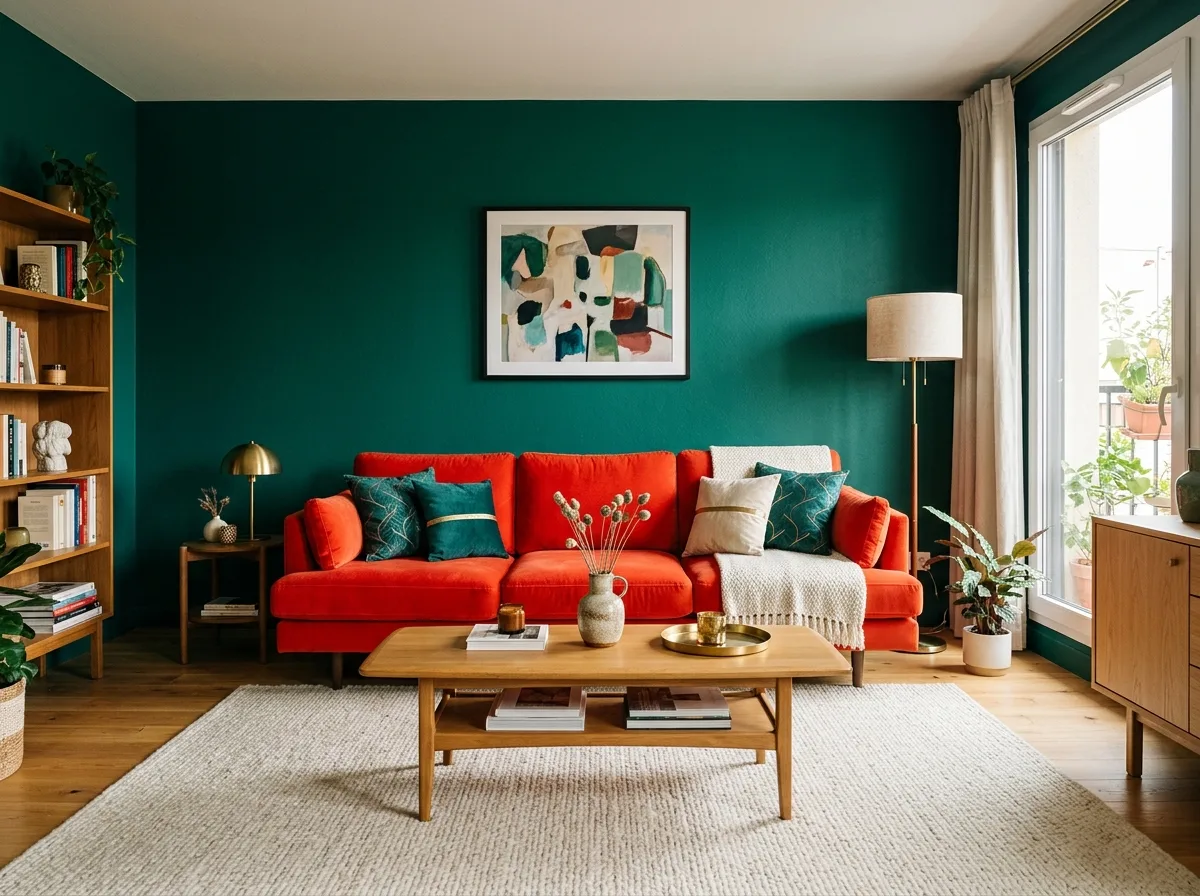
High-Saturation Color Blocking: Complementary Colors Clash in the Same Room
Prompt
A room that boldly uses complementary colors. The walls are saturated peacock green, while the sofa is an equally saturated fuchsia or vermilion—a pair of colors opposite on the color wheel, appearing simultaneously in large areas, creating a strong visual impact. To prevent this contrast from becoming chaotic, a third element is introduced as a buffer: a large amount of neutral colors—an off-white rug, natural wood furniture, black picture frames, occupying about forty percent of the image. The lightness and saturation of the other two colors are deliberately adjusted to be similar, so neither dominates the other. A small amount of brass provides a warm transition. Avoid: having too large a difference in lightness between the two colors, reducing the proportion of neutral colors too much, adding a third high-saturation color, or using low saturation to eliminate the contrast.
Translated from Chinese by AI.
Show the original prompt
一個大膽使用互補色的房間。牆面是飽和的孔雀綠,而沙發是同樣飽和的桃紅或朱紅——一組在色環上相對的顏色,同時出現在大面積上,產生強烈的視覺震動。為了讓這種對抗不至於失控,加入了第三個元素作為緩衝:大量的中性色——米白的地毯、原木的家具、黑色的畫框,佔畫面約四成。另外兩色的明度與彩度被刻意調到接近,誰也壓不過誰。少量的黃銅提供暖色的過渡。避免:讓兩色的明度差距過大、把中性色的比例壓到太低、加入第三種高彩度顏色、使用低彩度讓對比消失。




