Text-to-Image
Interior Design
通用
The Contemporary Version is Low Saturation
Prompt
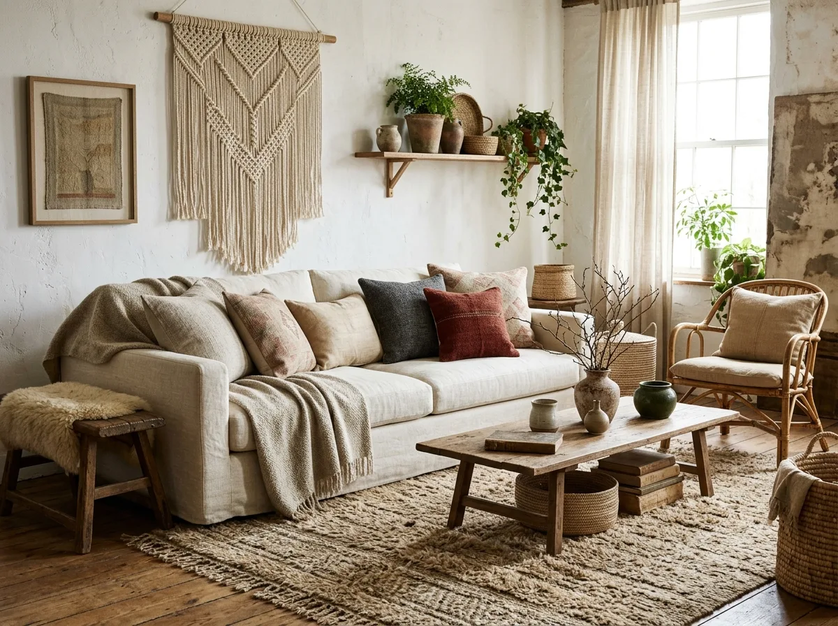
A contemporary version of a Bohemian space. The original 1970s version was intense: fuchsia, orange, purple, and a multitude of patterns layered together. Here, the colors are restrained: off-white, oatmeal, camel, ochre, and charcoal grey, all low-saturation natural colors; only one or two objects retain a deeper rust red or dark green. Layers come from texture and pattern, not from color clashes. Avoid: using high-saturation fuchsia, orange, and purple, having multiple bright colors appear simultaneously, using brightly dyed textiles, making the space look like 1970s hippie style.
Translated from Chinese by AI.
Show the original prompt
一個當代版本的波希米亞空間。七〇年代的原版是濃烈的:桃紅、橘、紫與大量的圖案疊在一起。這裡的顏色是收斂的:米白、燕麥、駝、赭土與炭灰,全部是低彩度的天然色;只有一兩件物件保留較深的鏽紅或墨綠。層次來自質地與圖案,不是來自色彩的碰撞。避免:使用高彩度的桃紅、橘與紫、讓多種鮮豔顏色同時出現、使用染色鮮明的織品、把空間做成七〇年代的嬉皮風。




