Text-to-Image
Landscape
通用
UK Road Signs: Transport Font and Mixed Case
Prompt
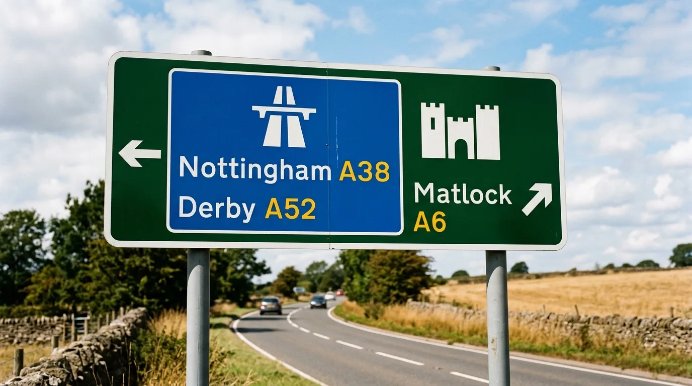
Design outdoor instructions based on the principles of the British road sign system: the typeface is a sans-serif specifically designed for legibility at high speeds, with the key decision being the use of mixed case rather than all caps—because the outer contour shape of a word can be recognized faster. Place names are graded by importance, arranged in different sizes and positions on the same board, and routes are distinguished by color blocks. The board surface is a rounded rectangle with a white border, and the background color depends on the road class. All spacing is determined by multiples of the cap height. Icons are simplified side-view silhouettes with thick lines. Mounted on posts, slightly angled towards oncoming traffic. Shot from a low angle beside an open road, with the sky as background. Avoid: all caps, thin typefaces, ungraded information, decorative borders on the board.
Translated from Chinese by AI.
Show the original prompt
以英國公路標誌系統的原則設計戶外指示:字體為專為高速移動中辨識而設計的無襯線,關鍵決定是採用混合大小寫而非全部大寫——因為單字的外輪廓形狀能被更快辨認。地名依重要性分級,以不同大小與位置編排在同一塊板上,路線以色塊區分。板面為圓角矩形,白邊,底色依道路等級而定。所有間距由字高的倍數決定。圖標為簡化的側視剪影,線條粗厚。設置於柱上,略微朝向來車。開闊的道路旁低角度拍攝,天空為背景。避免:全部大寫、字體纖細、資訊未分級、板面加裝飾邊框。