Text-to-Image
Interior Design
通用
Bauhaus Universal Typeface and Display Design: Lowercase and the Organization of Vision
Prompt
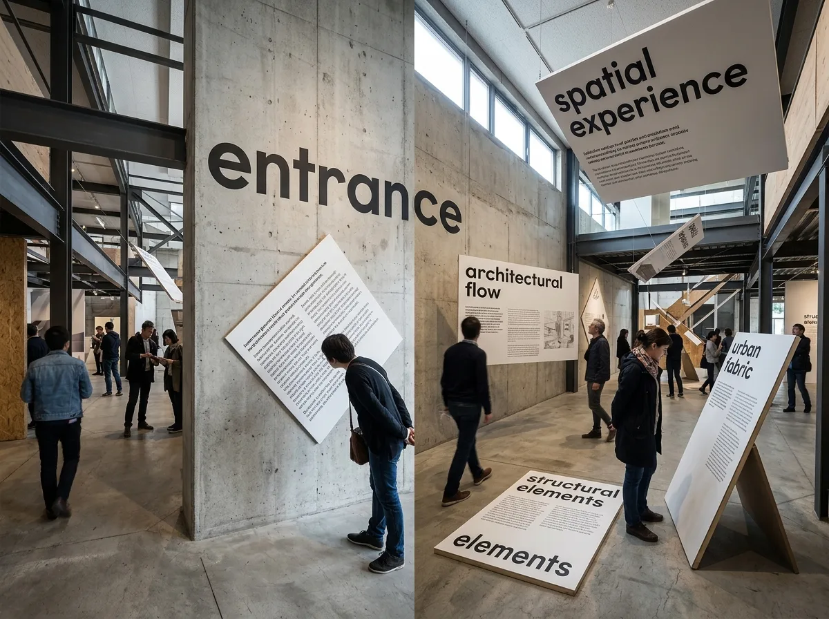
A sans-serif typeface composed of geometric primitives (circles, straight lines), eliminating uppercase and using only lowercase—the reason being that spoken language has no distinction between uppercase and lowercase, so writing should not add this unnecessary complexity. This typeface is used for architectural signage and exhibition spaces: text is painted directly on walls, with scale graded by importance. Exhibition design further organizes the viewer's field of vision—display panels are not just hung at eye level, but are tilted, suspended, or even placed on the ground and ceiling, forcing the body to turn and move. This is the starting point for treating "viewing" as a design object. Wide-angle shot of the exhibition hall, with display panels surrounding the viewer at multiple angles and heights. Avoid: all uppercase, all display panels parallel to walls and at the same height, serif typeface, symmetrical static spatial layout.
Translated from Chinese by AI.
Show the original prompt
以幾何原型(圓、直線)構成的無襯線字體,取消大寫只使用小寫——理由是口語裡沒有大小寫之分,書寫不該多此一舉。這套字體用於建築的標示與展示空間:文字直接漆在牆上,尺度隨重要性分級。展示設計則進一步組織觀者的視野——展板不只掛在視線高度,而是傾斜、懸吊、甚至置於地面與天花,迫使身體轉動與移動。這是把「觀看」當成設計對象的起點。展場廣角拍攝,展板在多個角度與高度環繞觀者。避免:全部大寫、展板全部平行牆面且等高、字體帶襯線、空間布局對稱靜態。




