Text-to-Image
Architecture
通用
Brick Typography: Relief Letters Formed by the Masonry Itself
Prompt
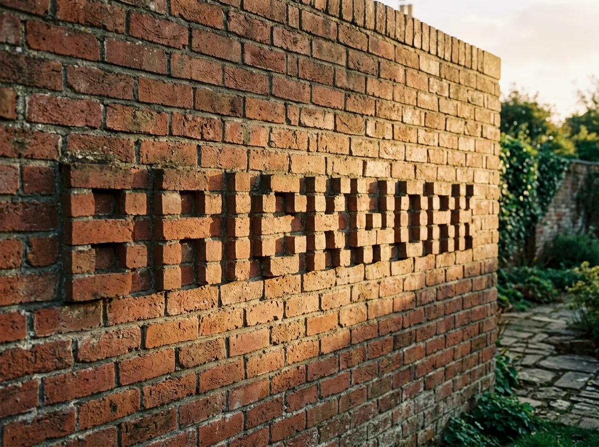
Brick-built text:凹凸 characters formed by the bricklaying method itself
No additional components are added; the text is directly formed by the protrusion and recession of the bricks. The typeface is entirely constrained by the brick module and laying method—stroke width is a multiple of the brick, and curves can only be approximated by steps, thus requiring a redesign of a dedicated brick-built font. The depth of protrusion is controlled to within half a brick, relying on shadows from oblique sunlight to make the characters emerge; when illuminated frontally, they almost blend back into the wall. The color variation of the bricks, the depth of the mortar joints, and the staggered pattern of the bricklaying are all part of the texture. Shot under low-angle sunlight in the early morning or evening.
Avoid: attached three-dimensional letters, excessive depth, typefaces not constrained by the brick module.
Translated from Chinese by AI.
Show the original prompt
不加任何額外構件,靠磚的凸出與退縮直接砌出文字。字形完全受制於磚的模矩與砌法——筆畫寬度是磚的倍數,曲線只能以階梯逼近,因此需要重新設計一套磚砌專用的字。凸出的深度控制在半塊磚以內,靠陽光斜射時的陰影讓字浮現,正面平光時則幾乎融回牆面。磚的色差、灰縫的深淺與砌法的錯縫都是質感的一部分。清晨或傍晚的低角度陽光下拍攝。避免:貼上去的立體字、深度過大、字形不受磚模矩約束。