Text-to-Image
Interior Design
通用
Difference from Warm Minimalism: One is Temperature, the Other is Boundary
Prompt
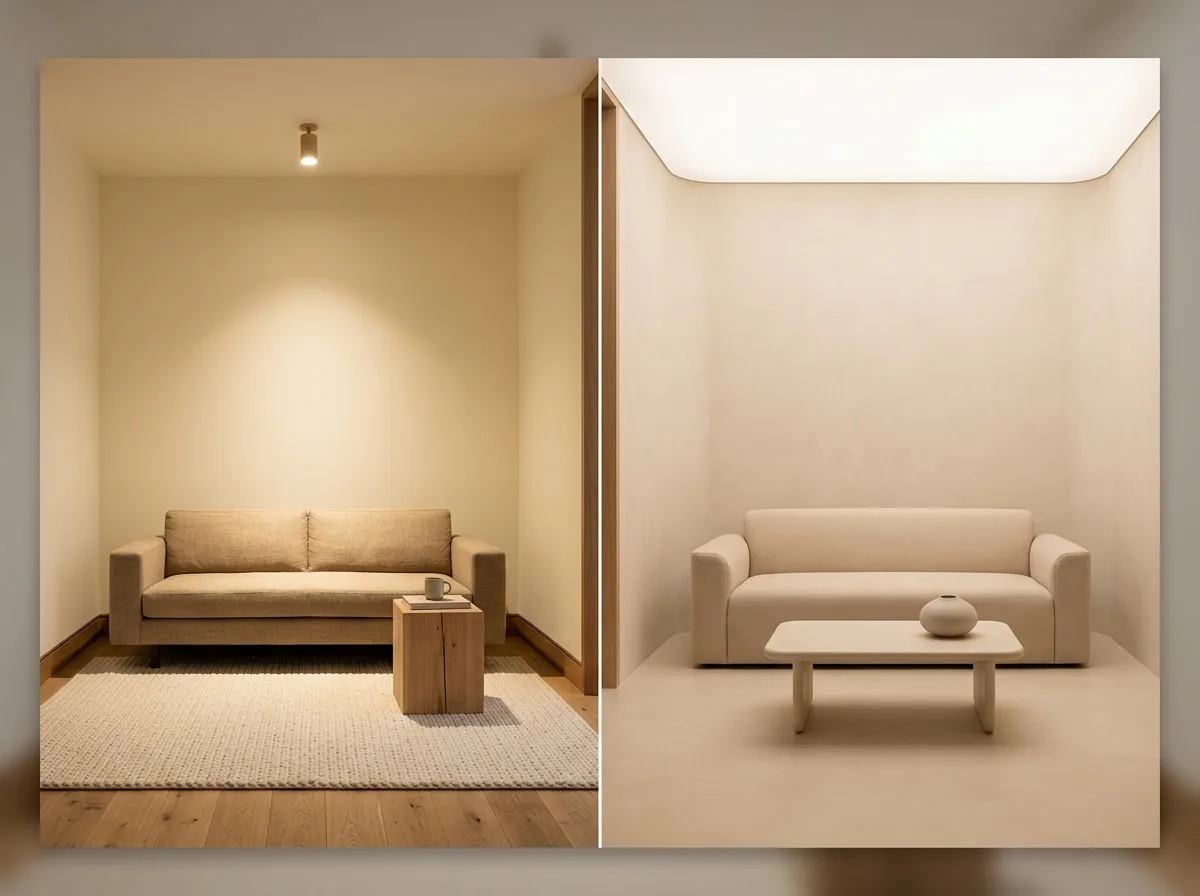
Two minimalist styles juxtaposed. On the left is warm minimalism: the focus is on warmth—warm white with a yellow tint, light brown wood, unpainted textures, 2700K warm light, and abundant wool and linen. Yet, the forms remain crisp, with right angles, clear boundaries, distinct material contrasts, and accent lighting used to highlight materials and create depth. On the right is soft minimalism: the focus is on boundaries—all edges are subtly chamfered, walls and ceilings are continuous without division, material colors are intentionally similar to blur transitions, all light is diffused without sharp shadows, and there are no blacks or highlights. Both have warm color temperatures; the difference lies in contrast and boundaries. Avoid: making the two look identical, depicting soft minimalism as an organic curved style, making warm minimalism lose its warm textures, changing the floor area or number of furniture pieces for either.
Translated from Chinese by AI.
Show the original prompt
兩種極簡的並置對照。左側是暖調極簡:重點在溫度——帶黃的暖白、淺褐的木、未上漆的質感、2700K 的暖光、大量的羊毛與亞麻;但形體仍然是俐落的,直角、明確的邊界、材料之間有清楚的對比,而且會用重點光打在材料上製造層次。右側是柔和極簡:重點在邊界——所有的邊都做了小倒角、牆與天花連續無分界、材料之間的顏色刻意相近到看不出交界、光全部是漫射的沒有銳利陰影、沒有黑也沒有高光。兩者的色溫都是暖的,差別在對比與邊界。避免:讓兩者看起來相同、把柔和極簡畫成有機曲面風格、讓暖調極簡失去溫暖的材質、改變兩者的坪數與家具數量。




