Text-to-Image
Interior Design
通用
The psychological cost of dark colors: not suitable for every room
Prompt
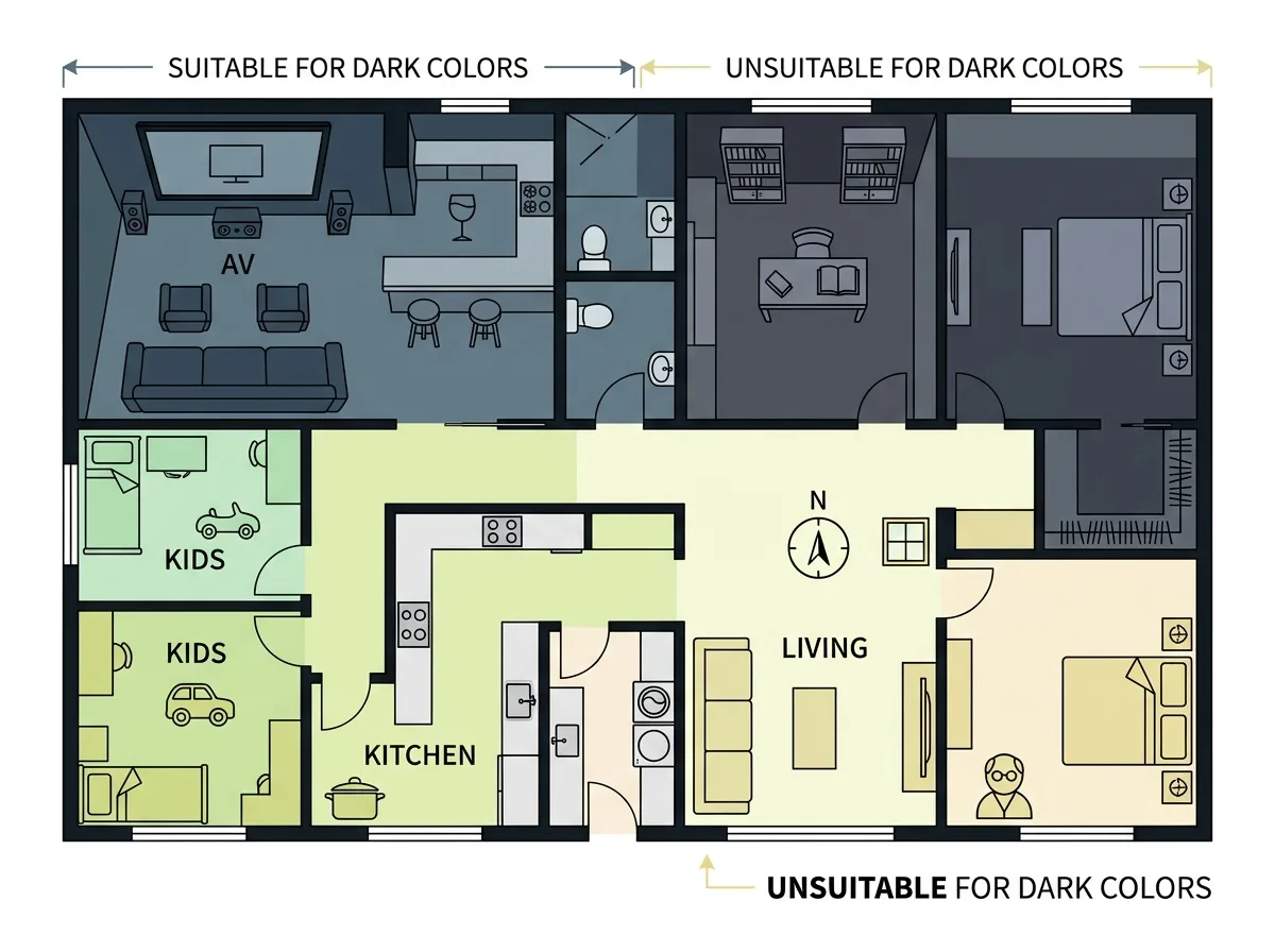
A layout diagram of a single residence, indicating which spaces are suitable for dark colors and which are not. Suitable spaces: home theater, bar corner, guest restroom, study, master bedroom—these spaces have optional stay times, static activities, or inherently require darkness. Unsuitable spaces: children's rooms, kitchen work surfaces, laundry and utility rooms, north-facing rooms with insufficient natural light, and spaces used by the elderly—these require sufficient illuminance, color discrimination, or users' eyesight needs more light. The image should flatly indicate this distribution and label the reason in each room. Avoid: making the entire residence dark, using dark colors in rooms with insufficient natural light, ignoring users' eyesight needs, making the labeled reasons unclear.
Translated from Chinese by AI.
Show the original prompt
一張同一戶住宅的配置圖解,標示哪些空間適合深色、哪些不適合。適合的:影音室、酒吧角、客用洗手間、書房、主臥——這些空間停留的時間是選擇性的、活動是靜態的、或本來就需要暗。不適合的:兒童房、廚房的工作面、洗衣與家事間、朝北且採光不足的房間、以及長輩使用的空間——這些需要足夠的照度、需要辨色、或使用者的視力需要更多光。畫面以平面的方式標示這個分佈,並在每一個房間標註理由。避免:把整戶都做成深色、把深色用在採光不足的房間、忽略使用者的視力需求、讓標示的理由不明確。




